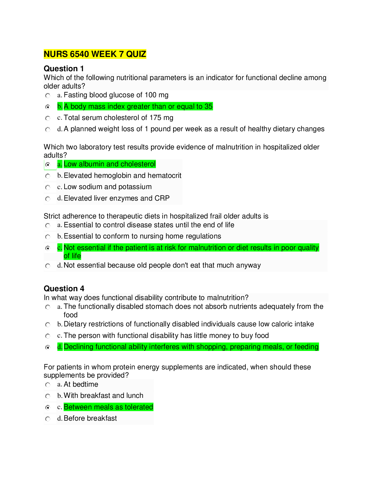
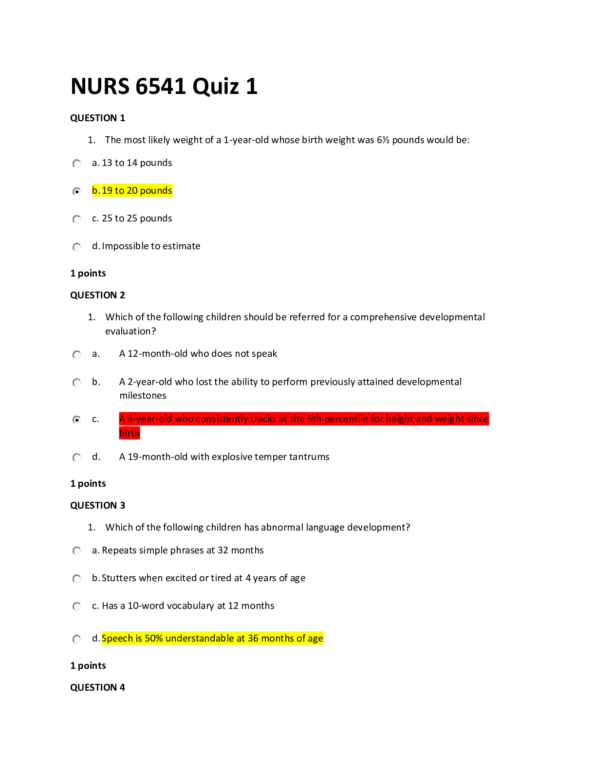
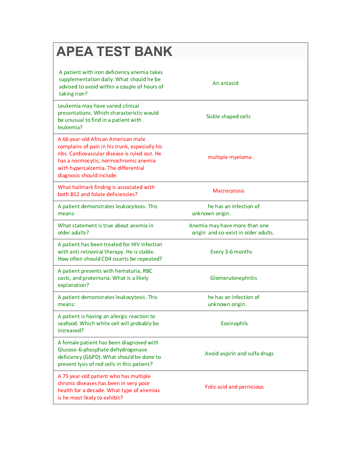
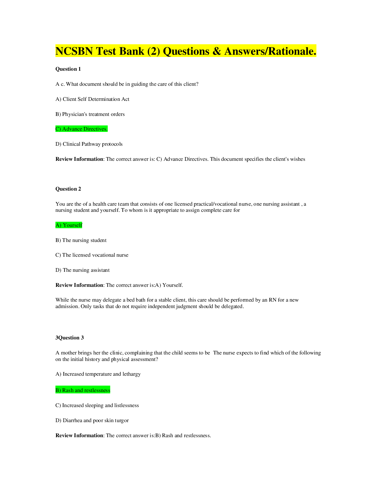
Sophia Visual Communications Milestone 2.
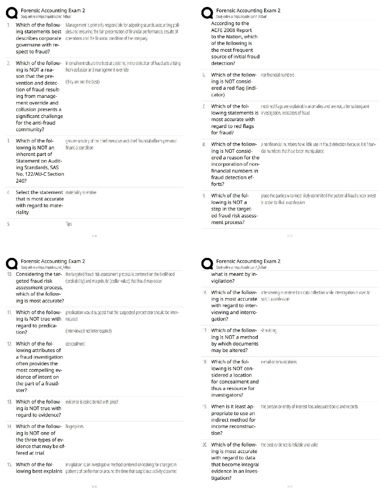
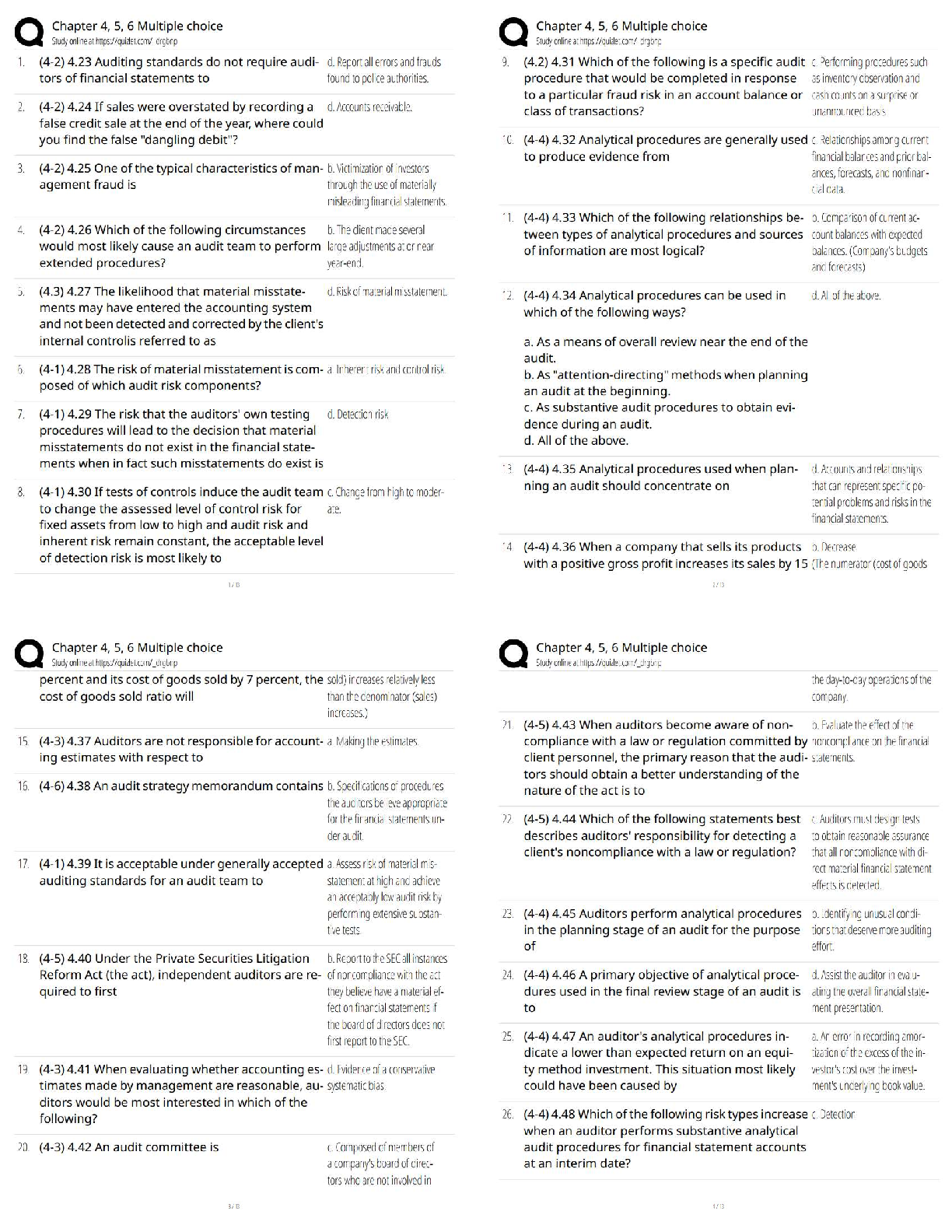
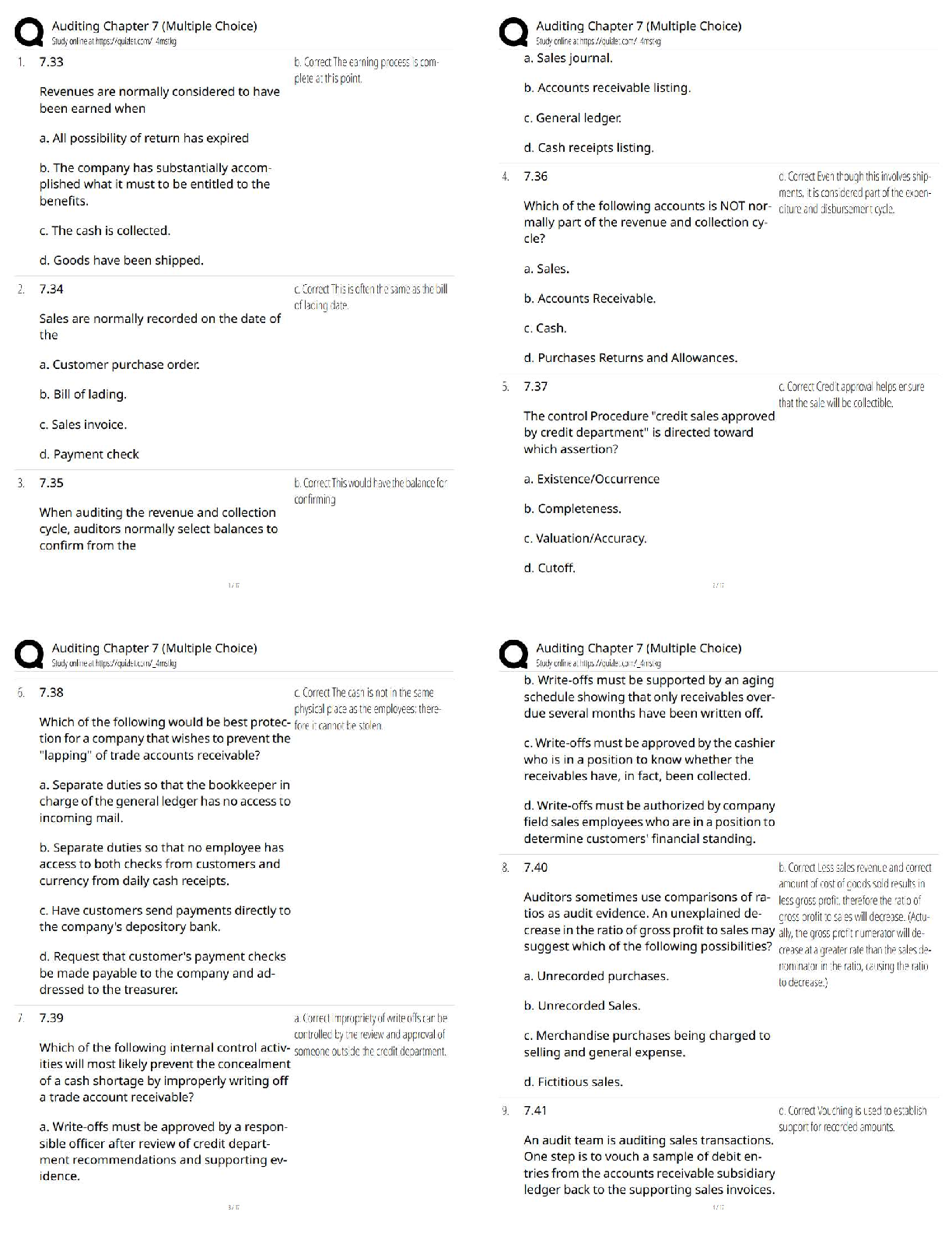
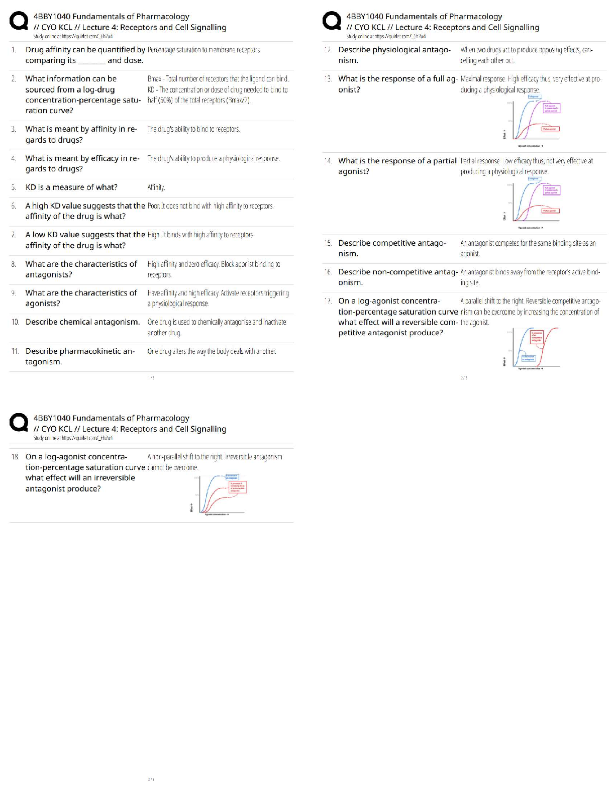
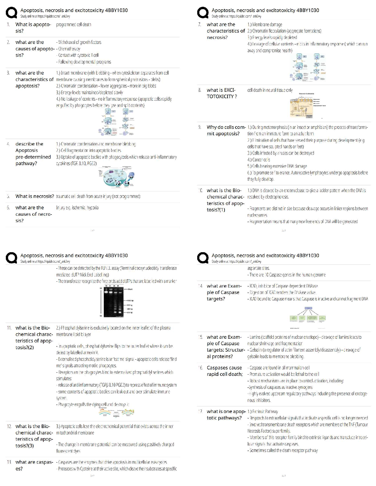
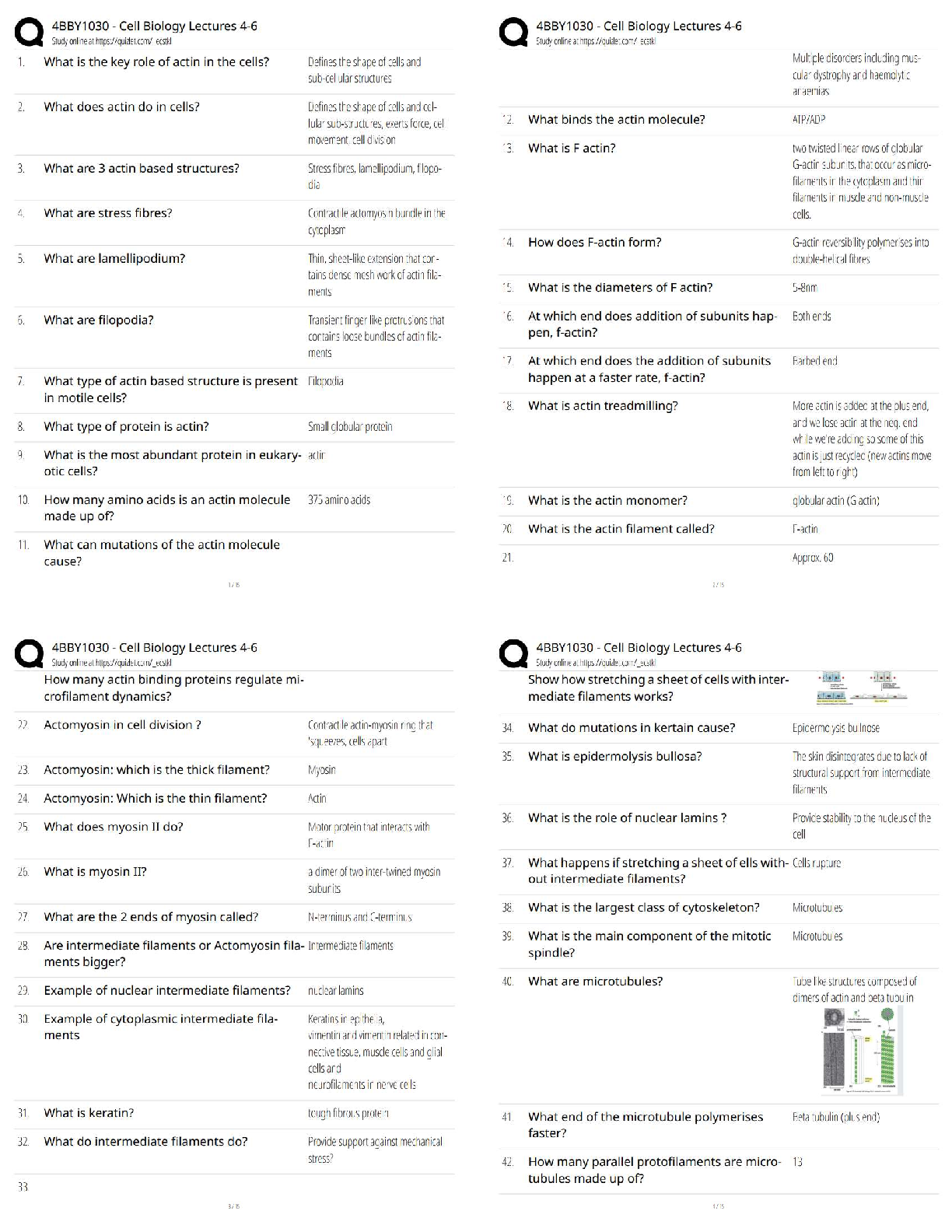
You passed this Milestone
20 questions were answered correctly.
4 questions were answered incorrectly.
1
Digital technology provided an improvement that freed designers from
...
Sophia Visual Communications Milestone 2.
You passed this Milestone
20 questions were answered correctly.
4 questions were answered incorrectly.
1
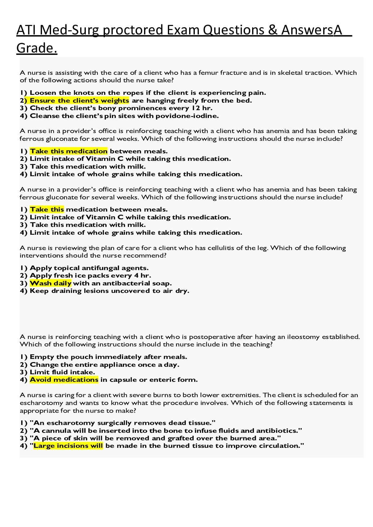
Digital technology provided an improvement that freed designers from the limitations of __________.
•
OpenType
•
monospaced type
•
TrueType
•
proportional type
2
Which of the terms listed below best describes the use of color in this sustainability poster?
•
Symbolic use of color
•
Chromotherapeutic use of color
•
Monochromatic use of color
3
[Digital image]. (n.d.). Retrieved from https://upload.wikimedia.org/wikipedia/commons/thumb/c/c5/Colorwheel.svg/540px-Colorwheel.svg.png
Which of the following are split complementary colors?
•
Yellow-orange, blue, and violet
•
Blue, yellow-orange, and green
•
Blue-green, violet, and orange
•
Green, blue-green, and violet
4
Based on this color wheel, which of the following is a secondary color?
•
Red
•
Yellow
•
Blue
•
Green
5
What is the correct description for the classification of type called "Old Style"?
•
This style is characterized by a geometric quality, with hairline thin serifs and extreme contrast between thick and thin strokes.
•
This style is characterized by elaborate, straight, angular strokes.
•
This style is characterized by low contrast between thick and thin strokes, and distinctive numerals.
•
This style is characterized by slab serifs and the use of even-weight strokes.
6
A grid-based layout commonly used in website design is called what?
•
Rebus
•
Mondrian
•
Silhouette
•
Circus
7
Mixing dabs of red and black acrylic paint, each straight from the tube, will result in a __________ of red.
•
tone
•
shade
•
tint
•
complement
8
Which of the following defines a typeface?
•
A capital letter form using different weights and widths
•
Contains all capital letterforms, of consistent posture and width
•
Contains the name of the publisher, family, weight, posture and width
•
A member of a complete set of letters, numbers and punctuation symbols
9
How is additive color seen?
•
When light is projected
•
When darkness is shown
•
Through the printing process
•
When color is reflected
10
What is the difference between a slanted typeface and an italic typeface?
•
Italic type is designed specifically to slant to the right. Slanted type is regular type that is slanted by a machine.
•
Italic type has poor readability. Slanted type has good readability.
•
Italic type is computer generated. Slanted type is based on hand-crafted script.
•
Italic type has serifs. Slanted type is sans-serif.
11
Which element is featured prominently in this layout grid?
•
Bleeds
•
Captions
•
Columns
•
Gutter
12
Comparing the International Style Movement to the de Stijl Style Movement, which statement is accurate?
•
The de Stijl Style and International Style Movements both originated in Switzerland.
•
de Stijl and International Styles both focus on serif type arrangements.
•
de Stijl focuses on primary colors, while the International Style is not tied to a color scheme.
•
International Style is loose and decorative, while de Stijl Style is rigid and grid-based.
13
Which of the following terms describes the sketch in this photo?
•
Bleed drawing
•
WYSIWYG drawing
•
Wireframe drawing
•
Modular drawing
14
Which two types of text alignment are used in this page layout?
•
Right alignment and free form
•
Centered alignment and justified alignment
•
Centered alignment and left alignment
•
Free form and justified alignment
15
Which of the layout characteristics listed below is contained in this image?
•
Headline
•
Justified type
•
Right alignment
•
Left alignment
16
Which image uses a golden section?
•
•
•
17
Which statement correctly explains kerning?
•
Kerning is the version of a typeface that is wider than its regular form.
•
Kerning is the white space between two letters.
•
Kerning is the spacing across a range of words in body copy.
•
Kerning is the white space between two lines of type.
18
Which of the following correctly defines the saturation of a color?
•
The intensity of the color
•
The transparency of a color
•
The temperature of the color in degrees Kelvin
•
The lightness or darkness of the color
19
Which of the following describes type weight?
•
The thickness of a letter stroke
•
The width of a letter stroke
•
The x-height of a letter stroke
•
The baseline of a letter stroke
20
CMYK color is used in which situation?
•
Reading a magazine on your phone
•
Reading a magazine printed on paper
•
Reading a magazine on your laptop computer
•
Reading a magazine on your tablet
21
Examine the two type examples. They are shown in the same point size. Why do they look different?
•
One of the fonts has been tracked very loosely.
•
One of the fonts needs to be kerned.
•
The fonts have two different X-heights.
22
Which list orders the elements from most prominent to least prominent?
•
Headline, body copy, caption
•
Headline, subhead, body copy
•
Headline, image, subhead
•
Headline, caption, body copy
23
Why is paragraph alignment important?
•
The paragraph alignment is the framework on which a design is built.
•
The paragraph alignment creates unity in a design.
•
Paragraph alignment impacts reading speed and how the eye is led through a design.
24
The computer graphics and 3D software programs that are used to create characters, spaceships, and worlds for big-screen films use which color process?
•
Four color
•
Additive
•
Subtractive
•
Pantone
[Show More]