Computer Science > QUESTIONS & ANSWERS > WGU C777 Unit 6: Designing for Mobile Devices 2022 with complete solution (All)
WGU C777 Unit 6: Designing for Mobile Devices 2022 with complete solution
Document Content and Description Below
WGU C777 Unit 6: Designing for Mobile Devices 2022 with complete solution fluid image ->>>Which responsive design technique adapts an image's size to the device's screen size by specifying a percen ... tage for each dimension? mobile app ->>>What do we call an application designed for a specific mobile operating system? mobile Web site ->>>What do we call a web site designed specifically for viewing on mobile device browsers? Responsive Web Design (RWD) ->>>What do we call a web site designed to adapt to many different devices? Grid-based layouts Resizable images Media queries ->>>What are three Responsive Web Design techniques use to adjusts gracefully for desktop, tablet and smartphone browsers? fluid grid ->>>What is an adaptive grid that uses percentage-based dimensions? Grid-based layouts ->>>What uses invisible guidelines to help you place page elements to accommodate various screen sizes? frameworks ->>>What tools, templates or boilerplates provide the basic foundation for responsive design? Bootstrap ->>>What is one of the most popular frameworks that provides a collection of HTML- and CSS-based design templates for typography, buttons, navigation, forms and other interface components? click-to-call ->>>What technique creates a link to dial a phone number? <a href="tel:18005551212"> Click Here </a> ->>>How do you implement the protocol that creates a link to dial a phone number? <a href="mailto:[email protected]"> Click Here </a> ->>>How do you implement the protocol that creates a link to draft an email? <a href="sms:18005551212"> Click Here </a> ->>>How do you implement the protocol that creates a link to send a text message? media queries ->>>What CSS3 technique checks a client device and then targets styles based on the device's properties? Placement of navigation elements Text-based hyperlinks Access to the full version of the site Limited links ->>>What navigation techniques should you employ for mobile devices? [Show More]
Last updated: 3 years ago
Preview 1 out of 5 pages

Buy this document to get the full access instantly
Instant Download Access after purchase
Buy NowInstant download
We Accept:

Also available in bundle (1)
Click Below to Access Bundle(s)
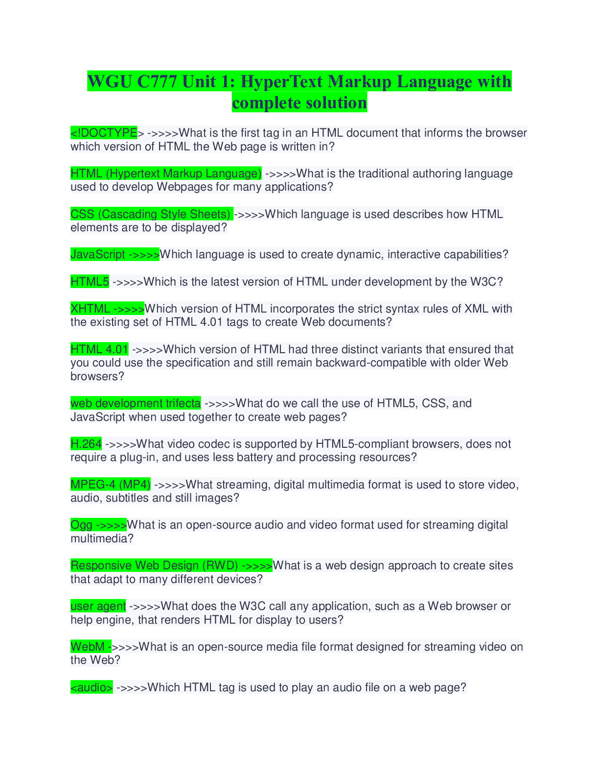
WGU C777 FULL SOLUTION PACK(ALL WGU C77 EXAMS AND STUDY QUESTIONS ARE HERE ,ALL ANSWERED CORRECTLY)
WGU C777 Unit 1: HyperText Markup Language with complete solution WGU C777 Unit 2: Cascading Style Sheets (CSS) 2022 with complete solution WGU C777 Unit 3: JavaScript 2022 with complete solutio...
By Excel 3 years ago
$14
6
Reviews( 0 )
$7.00
Can't find what you want? Try our AI powered Search
Document information
Connected school, study & course
About the document
Uploaded On
Sep 26, 2022
Number of pages
5
Written in
All
Additional information
This document has been written for:
Uploaded
Sep 26, 2022
Downloads
0
Views
129

