Information Technology > EXAM > WGU C777 Unit 6: Designing for Mobile Devices Questions and Answers Already Passed (All)
WGU C777 Unit 6: Designing for Mobile Devices Questions and Answers Already Passed
Document Content and Description Below
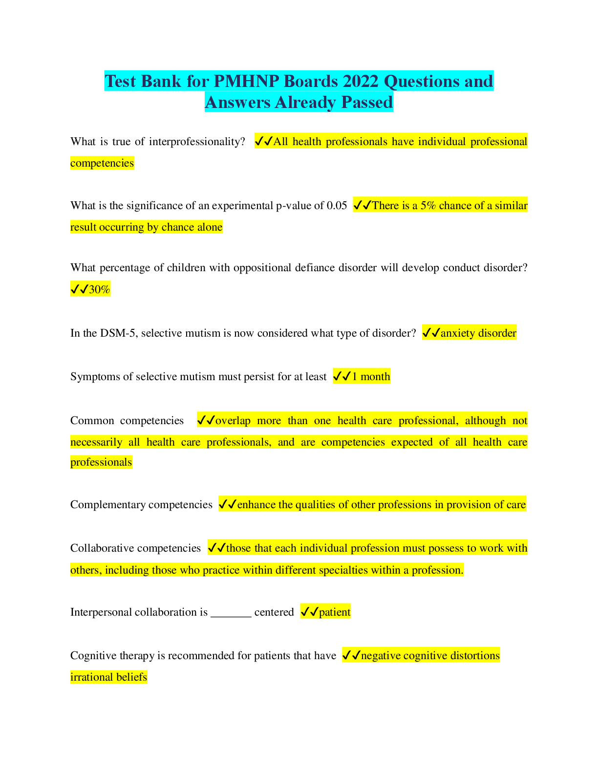
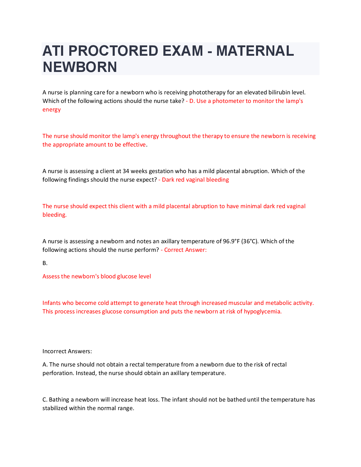
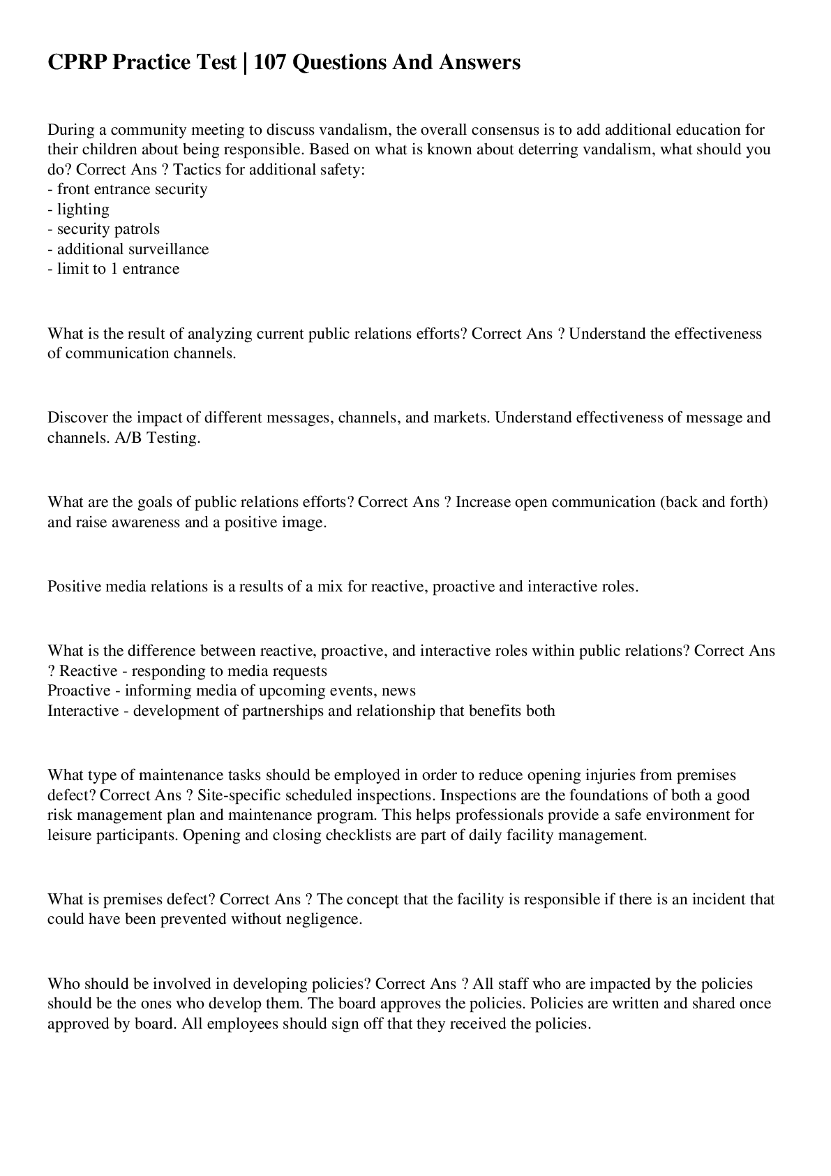
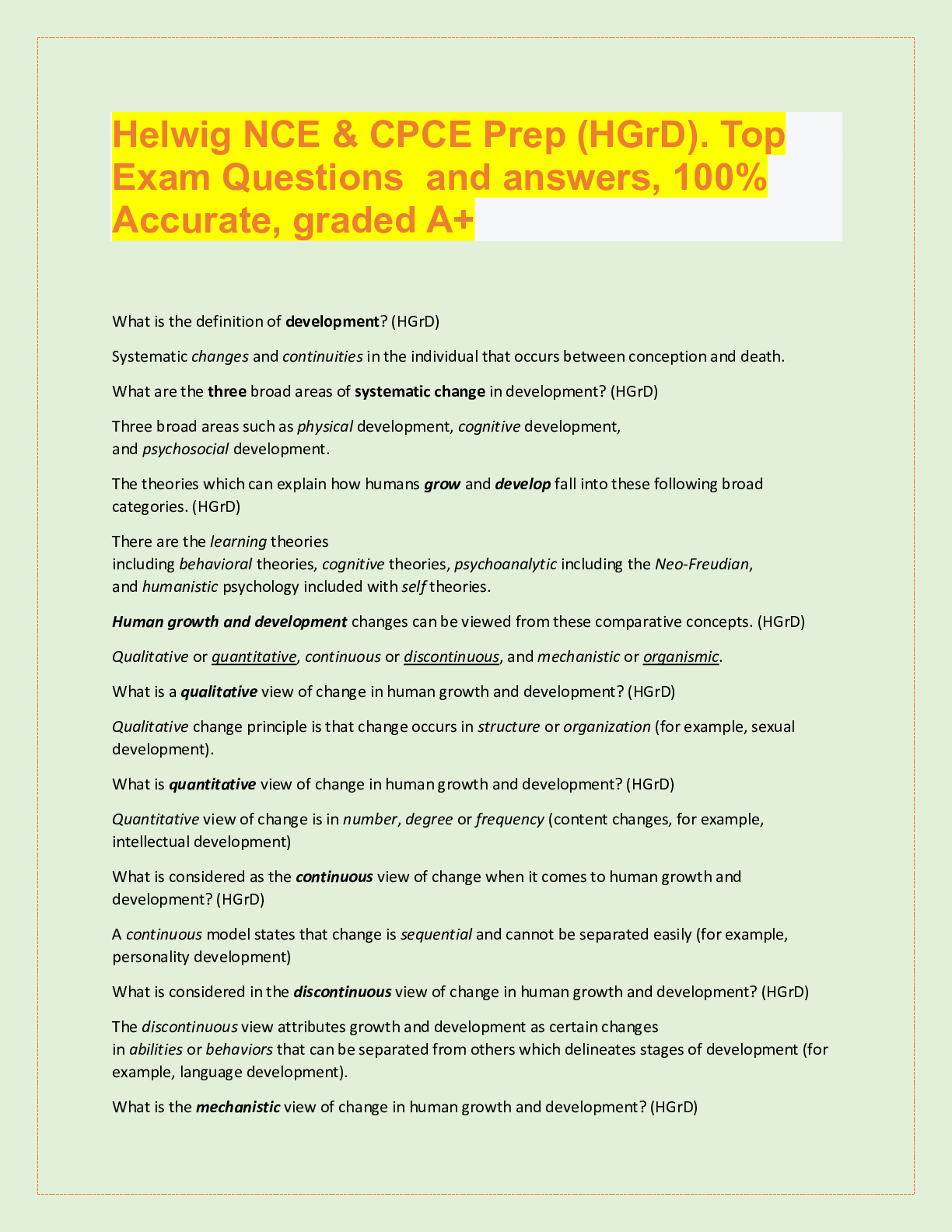
fluid image ✔✔Which responsive design technique adapts an image's size to the device's screen size by specifying a percentage for each dimension? mobile app ✔✔What do we call an application ... designed for a specific mobile operating system? mobile Web site ✔✔What do we call a web site designed specifically for viewing on mobile device browsers? Responsive Web Design (RWD) ✔✔What do we call a web site designed to adapt to many different devices? Grid-based layouts Resizable images Media queries ✔✔What are three Responsive Web Design techniques use to adjusts gracefully for desktop, tablet and smartphone browsers? fluid grid ✔ [Show More]
Last updated: 3 years ago
Preview 1 out of 5 pages
.png)
Buy this document to get the full access instantly
Instant Download Access after purchase
Buy NowInstant download
We Accept:

Also available in bundle (1)
Click Below to Access Bundle(s)
.png)
Bundle for WGU C777 Web Development Applications Tests | Updated & Verified | Everything you need to Pass!!
Bundle for WGU C777 Web Development Applications Tests | Updated & Verified | Everything you need to Pass!!
By Eustace 3 years ago
$30
23
Reviews( 0 )
$3.00
Can't find what you want? Try our AI powered Search
Document information
Connected school, study & course
About the document
Uploaded On
Sep 29, 2022
Number of pages
5
Written in
All
Additional information
This document has been written for:
Uploaded
Sep 29, 2022
Downloads
0
Views
85

.png)

.png)
