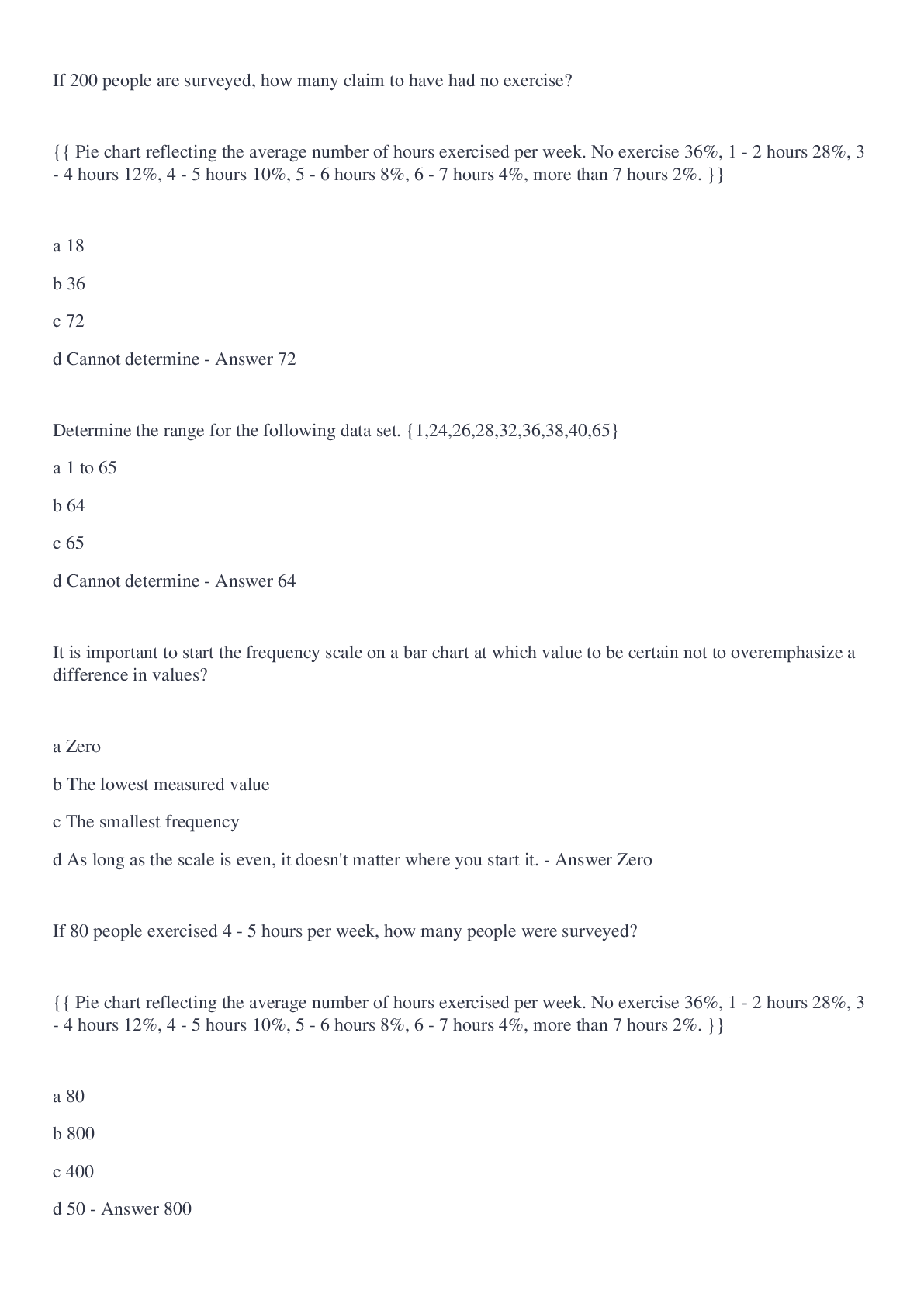
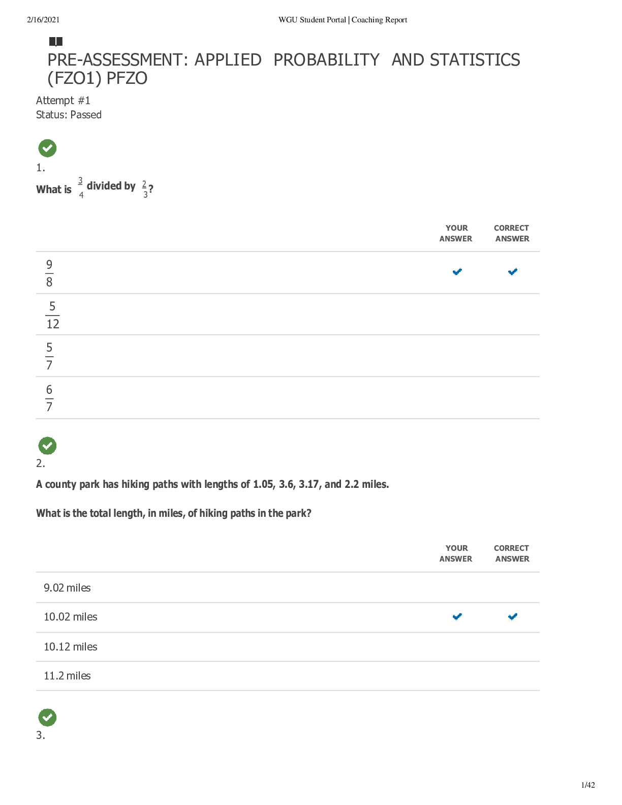
If 200 people are surveyed, how many claim to have had no exercise?
{{ Pie chart reflecting the average number of hours exercised per week. No exercise 36%, 1 - 2 hours 28%, 3 - 4 hours 12%, 4 - 5 hours 10%, 5 - 6 hou
...
If 200 people are surveyed, how many claim to have had no exercise?
{{ Pie chart reflecting the average number of hours exercised per week. No exercise 36%, 1 - 2 hours 28%, 3 - 4 hours 12%, 4 - 5 hours 10%, 5 - 6 hours 8%, 6 - 7 hours 4%, more than 7 hours 2%. }}
a 18
b 36
c 72
d Cannot determine
72
Determine the range for the following data set. {1,24,26,28,32,36,38,40,65}
a 1 to 65
b 64
c 65
d Cannot determine
64
It is important to start the frequency scale on a bar chart at which value to be certain not to overemphasize a difference in values?
a Zero
b The lowest measured value
c The smallest frequency
d As long as the scale is even, it doesn't matter where you start it.
Zero
If 80 people exercised 4 - 5 hours per week, how many people were surveyed?
{{ Pie chart reflecting the average number of hours exercised per week. No exercise 36%, 1 - 2 hours 28%, 3 - 4 hours 12%, 4 - 5 hours 10%, 5 - 6 hours 8%, 6 - 7 hours 4%, more than 7 hours 2%. }}
a 80
b 800
c 400
d 50
800
You are a professional trainer at a local sports academy. You ask your athletes to determine the number of grams of protein they consume for a particular meal. Which of the following would be the best choice to illustrate the shape of the data you collect?
a Bar chart
b Pie chart
c Box plot
d None of the above
Box plot
What is the most significant difference between histograms and bar charts?
a The number of bars used
b The use of labels on the axes
c The type of data depicted in the graph
d The coloring used for each bar
The type of data depicted in the graph
Of the following sets of data, which would you assume should have the greatest range?
a Age when a baby gets their first tooth
b Age of first-year business students
c Age of death
d Age of high school graduate
Age of death
Determine any outliers in the following data set. {1,24,26,28,32,36,38,40,65}
a 1
b 65
c A and B
d None
A and B
Determine the interquartile range ( IQR ) for the following set of diagnostic test scores. {60,47,65,85,81,77,70,56,47,84,75}
a 25
b 57
c 68
d 80
25
Stem plots display which type of data?
a Quantitative
b Categorical
c Neither Quantitative nor categorical
d Quantitative and categorical
Quantitative
Determine the median for the following set of diagnostic test scores.{60,47,65,85,81,77,70,56,47,84,75}
a 67
b 70
c 47
d 67.9
70
Determine Q3 for the sorted list of data values. {3,8,8,10,16,20,20,23,27,37,44,45,62,71}
a 27
b 37
c 44
d 45
44
The bitrate of audio files in a sample group of files ranged from 160 kilobytes per second (Kbps) to 256 kilobytes per second (Kbps). What percentage of the audio files will fall within 2 standard deviations of the mean? Assume the data is normally distributed.
a 34%
b 68%
c 95%
d 99.7%
95%
Which of the following are best used to display categorical data?
a Histogram
b Dot plot
c Pie chart
d Stem plot
Pie chart
When observing a box plot, what percentage of the measured data lies between Q1 and the maximum value in the list?
a 75%
b 50%
c 25%
d Cannot determine.
75%
Which of the four different sets of numbers would have the greatest standard deviation?
a 5,5,5,5,5
b 5,6,7,8,9
c 1,8,16,25,33
d 40,43,45,47
1,8,16,25,33
Determine the best estimate for the total number of ice creams sold on Monday and Tuesday.
{{ Bar Chart reflecting the average number of ice creams sold on each day of the week. Mon. 70, Tue. between 60 and 70, Wed. between 50 and 60, Thur. between 40 and 50, Fri. between 60 and 70, Sat between 30 and 40, Sun. 30. }}
a 100
b 112
c 137
d 148
137
Please use the dot plot below to answer the following question. Dot Plot displaying the following data points: 5, 6, 6, 7, 8, 8, 8, 9, 9, 10.
Determine the median for the data.
a 7
b 7.5
c 8
d Cannot determine.
8
The return on investment (ROI) in a sample population of investments ranged from 8% to 23% . What percentage of the sample will fall within 1 standard deviation above the mean? Assume the data is normally distributed.
a 47.5%
b 13.5%
c 68%
d 34%
34%
Arrange the mean, median, and mode in order from least to greatest in a distribution that it is positively skewed.
a Median, mode, mean
b Mean, median, mode
c Mean, mode, median
d Mode, median, mean
Mode, median, mean
If the following data are represented on a stem plot, how many leaves would be shown on the " 6 " stem? {57,63,55,59,52,60,65,56,56,65,55,63}
a 5
b 4
c 3
d 2
5
If 15 people exercised 3 - 4 hours per week, how many people were surveyed?
{{ Pie chart reflecting the average number of hours exercised per week. No exercise 36%, 1 - 2 hours 28%, 3 - 4 hours 12%, 4 - 5 hours 10%, 5 - 6 hours 8%, 6 - 7 hours 4%, more than 7 hours 2% .}}
a 18
b 180
c 1250
d 125
125
If 150 people are surveyed, how many claim to have exercised 6 - 7 hours per week?
{{ Pie chart reflecting the average number of hours exercised per week. No exercise 36%, 1 - 2 hours 28%, 3 - 4 hours 12%, 4 - 5 hours 10%, 5 - 6 hours 8%, 6 - 7 hours 4%, more than 7 hours 2% .}}
a 6
b 60
c 38
d Cannot determine
6
What can sometimes cause a bar graph or histogram to be misleading?
a Whether or not the bars are touching
b Starting the numerical scale on the vertical axis at a value other than zero
c Leaving out a numerical scale on the vertical axis
d b and c
b and c
Determine any outliers in the following data set. {55,77,64,82,58,75,57,49,106,71,68,76}
a 49
b 106
c Both A and B
d There are no outliers in the data set.
106
On average, Lightning Communications delivers to their customers, high-speed Internet connections of 70 Mbps, with a standard deviation of 12 Mbps. About what percentage of customers will experience a network speed between 70.0 Mbps and 94.0 Mbps? Assume a normal distribution.
a 68%
b 34%
c 47.5%
d 49.85%
47.5%
What would be the best type of graph to use to display the age of all employees in a particular division in a company?
a Bar chart
b Histogram
c Scatterplot
d Pie chart
Histogram
Of the following sets of data, which would you assume should have the smallest range?
a Price in dollars ($) of penny stocks currently being traded over-the-counter through the OTC Bulletin Board.
b Ages of stockbrokers currently on the trading floor.
c The number of trades on the NYSE on any given day.
d The ages of interns currently in the college summer internship program.
The ages of interns currently in the college summer internship program.
Assuming a population is normally distributed, what percentage of the population will fall within 3 standard deviations of the mean?
a 98.6%
b 68%
c 95%
d 99.7%
99.7%
Which of the four different sets of numbers would have the least standard deviation?
a 5,5,5,5,5
b 5,6,7,8,9
c 1,8,16,25,33
d 40,43,45,47
5,5,5,5,5
Determine the range for the following data set. {55,77,64,82,58,75,57,49,86,71,68,76}
a 33
b 31
c 27
d 37
37
Does a box plot include the mean of a set of data?
a Yes, a box plot includes both the mean and the median.
b No, a box plot does not include the mean.
No, a box plot does not include the mean.
You are designing a study to determine if the amount of an individual's annual 401K contribution is dependent upon the number of hours she or he works per week. You survey a group of 900 men and women aged 20 - 60 and record the number of hours each person works per week versus their total annual 401K contribution. What type of data are you collecting?
a Categorical
b Qualitative
c Quantitative
d Both a and b.
Quantitative
Determine the mean for the data.
{{ Dot Plot displaying the following data points: 5, 6, 6, 7, 8, 8, 8, 9, 9, 10. }}
a 7
b 7.5
c 7.6
d Cannot determine
7.6
Determine Q3 for the following set of data values. {60,47,65,85,81,77,70,56,47,84,75}
a 25
b 57
c 68
d 81
81
Determine the mean for the following set of data values. {60,47,65,85,81,77,70,56,47,84,75}
a 67
b 70
c 47
d 68
68
What type of data is represented in a histogram?
a Quantitative
b Categorical
c Both A and B
d Neither A nor B
Quantitative
Determine Q1 for the sorted list of data values. {3,8,8,10,16,20,20,23,27,37,44,45,62,71}
a 8
b 10
c 11
d 16
10
What type of data is presented in this chart?
{{ Bar Chart reflecting the average number of ice creams sold on each day of the week. Mon. 70, Tue between 60 and 70, Wed. between 50 and 60, Thur. between 40 and 50, Fri. between 60 and 70, Sat between 30 and 40, Sun. 30. }}
a Categorical
b Quantitative
c Numerical
d Both b and c
Categorical
Arrange the mean, median, and mode in order from least to greatest in a distribution that it is skewed left.
a Median, mode, mean
b Mean, median, mode
c Mean, mode, median
d Mode, median, mean
Mean, median, mode
What type of distribution is shown in the histogram below?
{{ Histogram illustrating a distribution of weights in pounds. The long tail of the graph is to the right of the peak }}
a) Normal
b) Negatively Skewed
c) Positively Skewed
d) Cannot determine
Positively Skewed
The mean salary of an entry-level financial analyst in Anytown is $ 65,300 and the standard deviation is $ 11,300. What values would 95% of the data fall between? Assume a normal distribution.
a) $ 47,200 and $ 89,700
b) $ 42,200 and $ 86,000
c) $ 42,700 and $ 87,900
d) $ 41,600 and $ 86,800
$ 42,700 and $ 87,900
Assuming that the heights of adult males in the United States are normally distributed, what is the approximate percentage of adult males who have a height (in ft.) within 1 standard deviation of the mean?
a) 50%
b) 68%
c) 95.4%
d) 99.7%
68%
What is the range of the following data set?
68 60 68 64 84 48 60 80 80 58 62 52
a) 26
b) 28
c) 32
d) 36
36
What is the mean of the following data set?
68 60 68 64 84 48 60 80 80 58 62 52
a) 65.3
b) 69.2
c) 61.6
d) 64.4
65.3
What is second quartile ( Q2 ) of this data set?
78 85 87 90 100 105 117 123 125 125 128 135 140 152 159 165 169 179
a) 123
b) 124
c) 125
d) 125.5
125
What is the first quartile ( Q1 ) of this data set?
78 85 87 90 100 105 115 117 123 125 125 128 135 140 152 159 160 169 179
a) 100
b) 103.5
c) 105
d) 102.5
102.5
What is the third quartile ( Q3 ) of this data set?
78 85 87 90 100 105 115 117 123 125 125 128 135 140 152 159 160 169 179
a) 152
b) 155.5
c) 157
d) 159
155.5
Which of the following would be the best option to graphically display continuous data?
a) Bar Chart
b) Histogram
c) Pie Chart
d) Box Plot
Histogram
Which of the following is defined as data that represents values that can be counted or measured?
a) descriptive data
b) qualitative data
c) categorical data
d) quantitative data
quantitative data
[Show More]


.png)


.png)