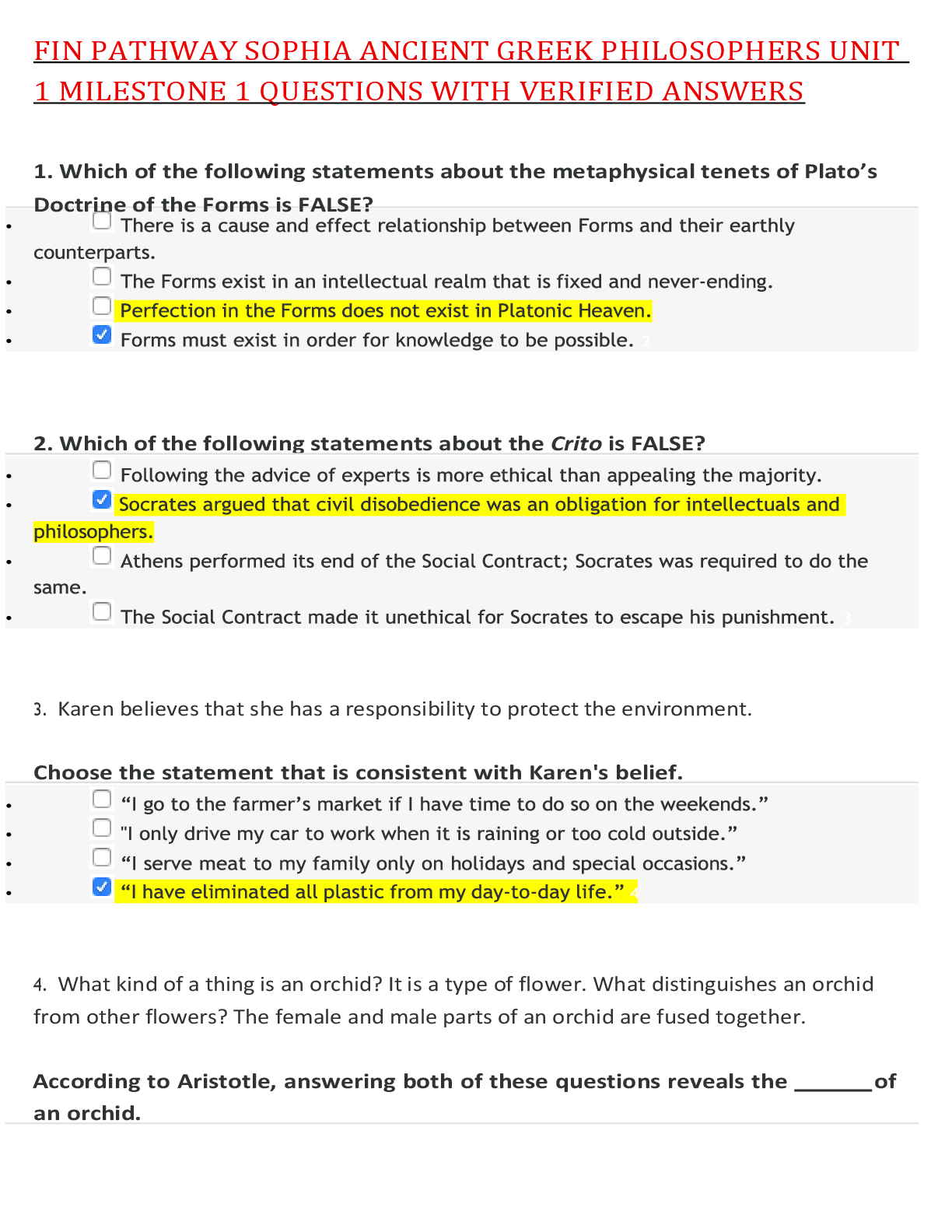
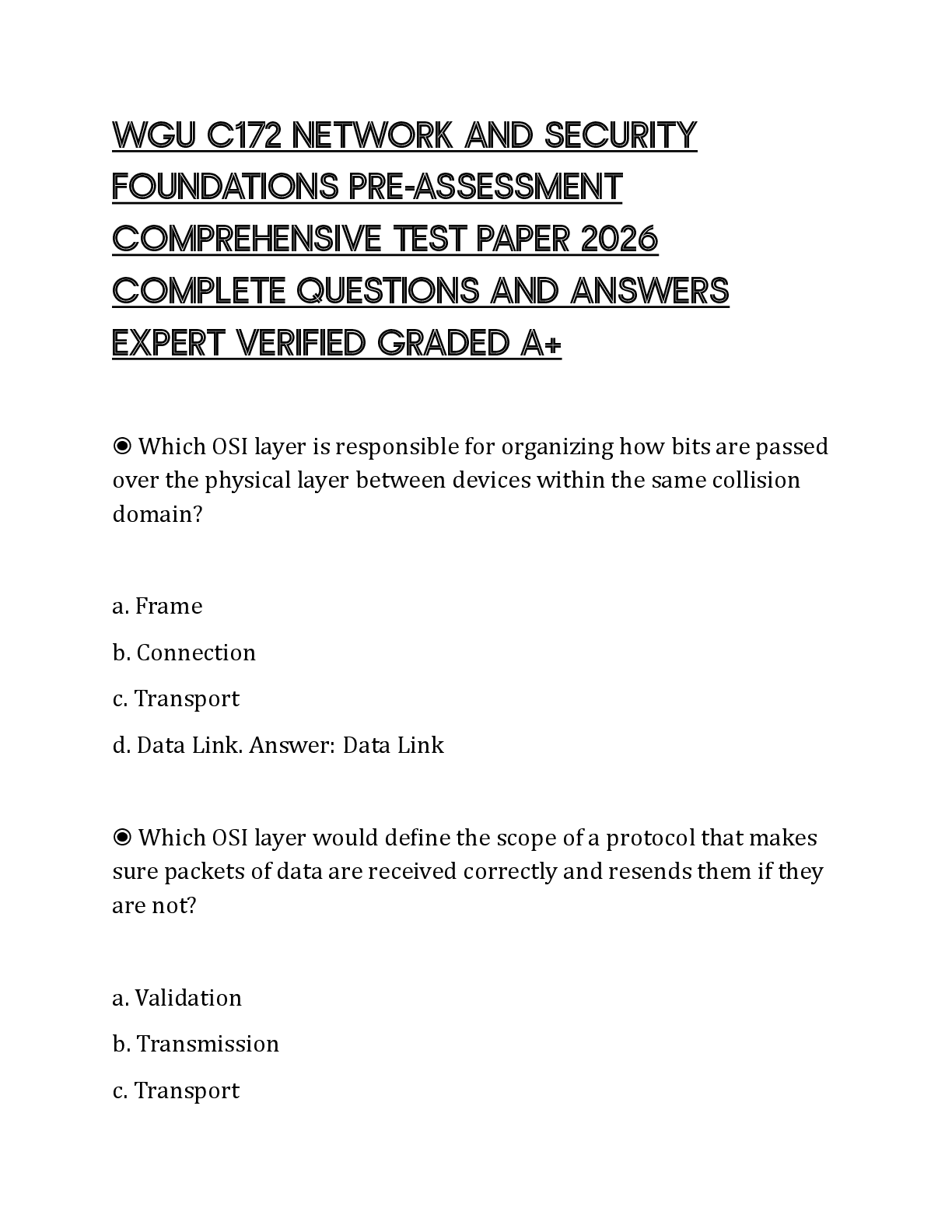
Which answer correctly describes the Postscript Type 1 font format?
•
The most recent font file format that works on both Windows and Macintosh computers
•
A font format developed by Microsoft, with versions avai
...
Which answer correctly describes the Postscript Type 1 font format?
•
The most recent font file format that works on both Windows and Macintosh computers
•
A font format developed by Microsoft, with versions available for both Windows and Macintosh computers
•
A font format that was developed by Apple and only works on Macintosh computers
•
The font format developed by Adobe that consists of two computer files
2
Which of the following describes type weight?
•
The x-height of a letter stroke
•
The baseline of a letter stroke
•
The width of a letter stroke
•
The thickness of a letter stroke
3
A grid-based layout commonly used in website design is called what?
•
Silhouette
•
Circus
•
Rebus
•
Mondrian
4
How are wireframes used?
•
Wireframes contain typeface choices for web and graphic designers.
•
Wireframes enable web and graphic designers to create colors to use in their designs.
•
Wireframes help web designers to develop the structure of their websites.
•
Wireframes are used in print layout.
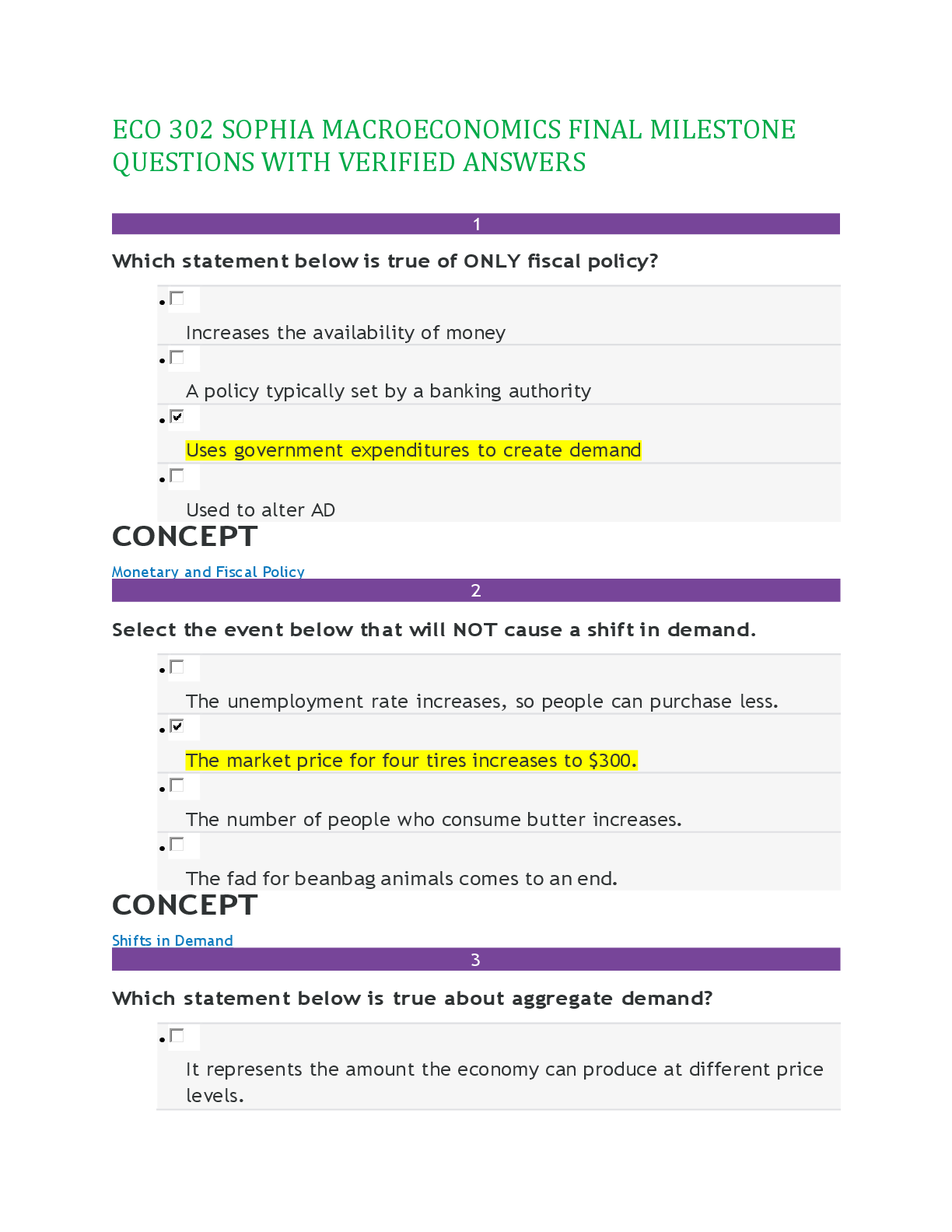
5
What are some of the characteristics of the Blackletter typeface?
•
Blacketter was popularized by the Bauhaus movement and includes thin serifs.
•
Blacketter was based on written manuscripts and has elaborate, angular strokes.
•
Blacketter originated in the 1400's and is known for its symmetry and strokes of even weight.
•
Blacketter was based on ancient roman inscriptions and has a contrast between thick and thin strokes.
6
Which of the layout characteristics listed below is contained in this image?
•
Right alignment
•
Headline
•
Left alignment
•
Justified type
7
Which of these terms relates to the white space between lines of type?
•
Tracking
•
Kerning
•
Leading
•
X-Height
8
Which statement is correct as it relates to color use in Eastern culture?
•
Green is often used during traditional holidays because it represents happiness.
•
At the turn of the New Year, you would see white, symbolic of good fortune.
•
You would likely see red used at a traditional wedding, because it is a symbol of prosperity.
•
You would see black used at a funeral as a symbol of death and mourning.
9
Which one of the following items describes a component contained in this newspaper design?
•
Display type
•
Script typeface
•
Right aligned type
•
Monochromatic
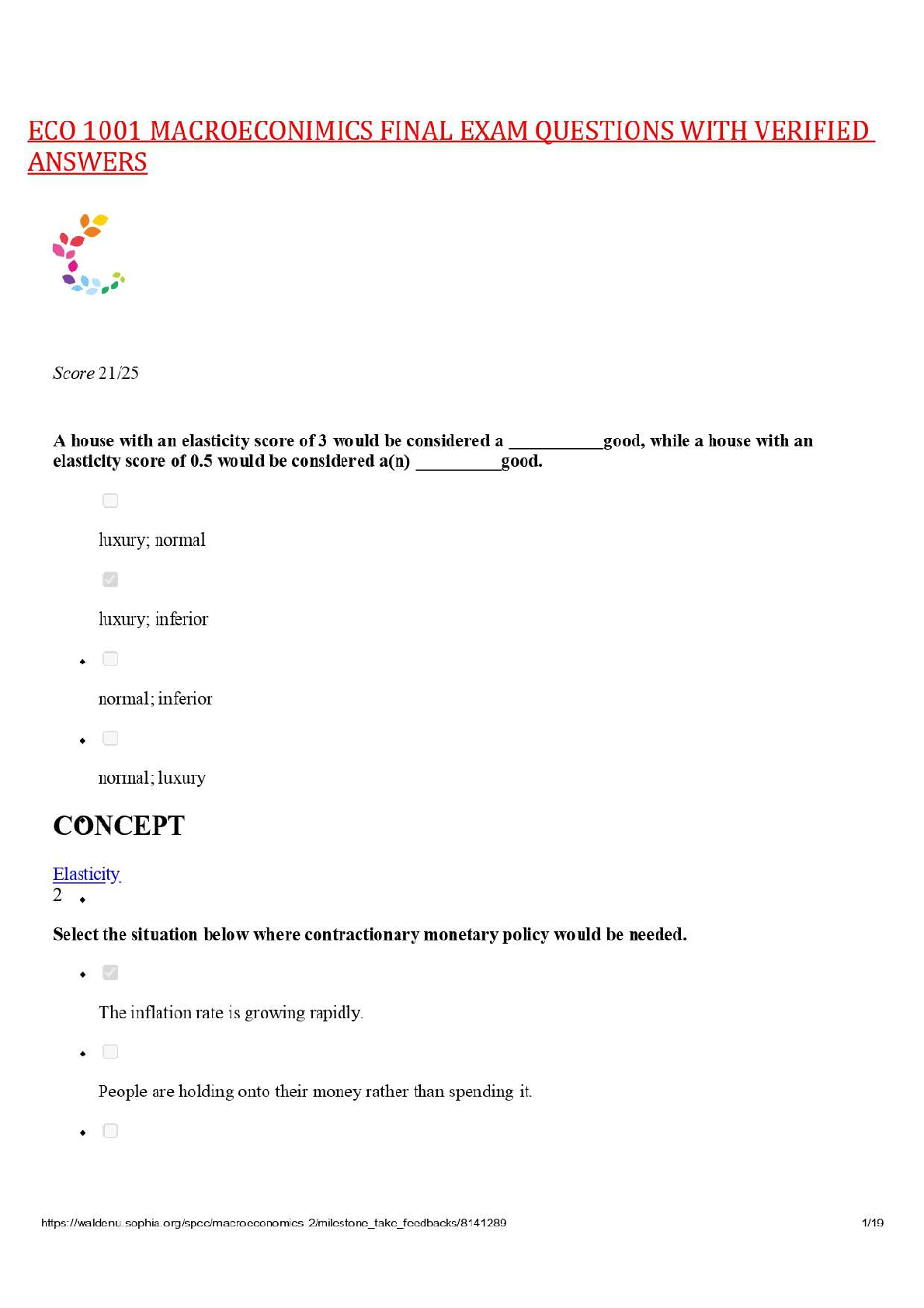
10
Which set of hues in the list below is a complementary pair?
•
Green and gold
•
Purple and yellow
•
Blue and red
•
Violet and green
11
Which example represents proper usage of decorative type?
•
Anil uses decorative type for his entire paragraph to keep his design fun.
•
Cedric includes decorative type in his headline to draw attention to his design.
•
Margo uses decorative type for captions below photos in a magazine.
•
Patricia uses decorative type for her company website address on train station advertisements.
12
Which of the following best defines the subtractive color process?
•
The mixing of color with pigment; subtractive color is seen when light is absorbed or reflected by pigment.
•
The mixing of powdered color; mixing color that is seen when light is absorbed or reflected by pigment.
•
The mixing of subtractive color; using PMS color that is seen when light is absorbed or reflected by pigment.
13
Which one of the following layout terms applies to this poster design?
•
The International Style
•
Mondrian
•
Circus
•
Grid
14
Which of the following statements is NOT true about this image?
•
The image shows a wide range of lightness.
•
The image shows a wide range of elements.
•
The image shows a wide range of temperatures.
•
The image shows a wide range of value.
15
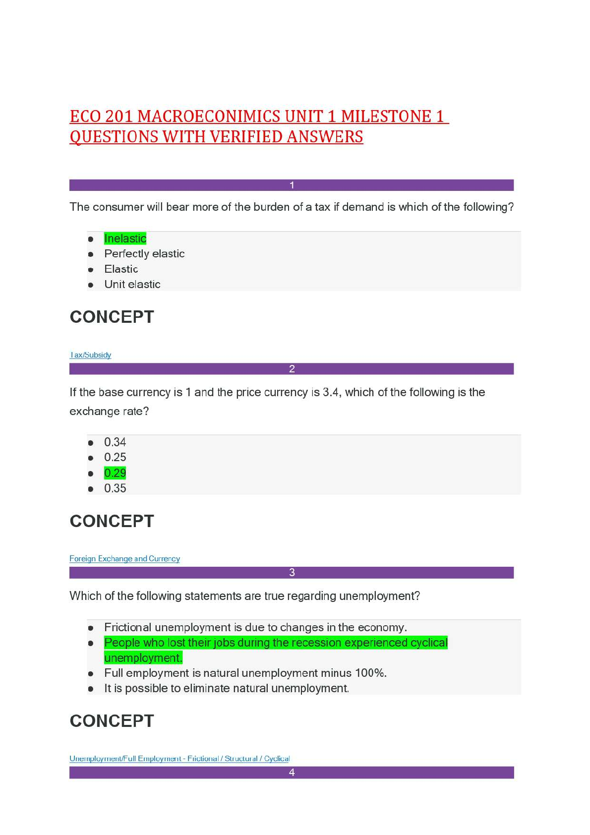
When creating a graphic on your computer screen for a website, which color system would you use?
•
Hexadecimal color
•
CMYK
•
PMS
•
16
Based on this color wheel, which of the following is a secondary color?
•
Blue
•
Red
•
Green
•
Yellow
17
When red and grey are mixed together, the result is a different __________ of red.
•
tint
•
tone
•
complement
•
shade
18
When laying out a project, why is it important to carefully consider spacing, typeface and posture?
•
These choices prevent designers from placing text too close together.
•
These choices produce easy reading, which is always the goal of design.
•
These choices guide the eye to focus on the most important details first.
•
These choices enable designers to generate the most creative design possible.
19
Which type family is sans-serif?
•
•
•
•
20
How tall is a word that is set in 72-point type?
•
One-half inch
•
One pica
•
One inch
21
Which typographic example applies hierarchy principles?
•
•
•
•
22
Which image uses a golden section?
•
•
•
23
The computer graphics and 3D software programs that are used to create characters, spaceships, and worlds for big-screen films use which color process?
•
Additive
•
Pantone
•
Four color
•
Subtractive
24
Which two types of text alignment are used in this page layout?
•
Right alignment and free form
•
Centered alignment and left alignment
•
Free form and justified alignment
•
Centered alignment and justified alignment
[Show More]


 2022 test Bank.png)