Based on this color wheel, which of the following is a secondary color?
• Green
• Yellow
• Blue
• Red
2
Which answer correctly describes the Postscript Type 1 font format?
• A font format that was developed by App
...
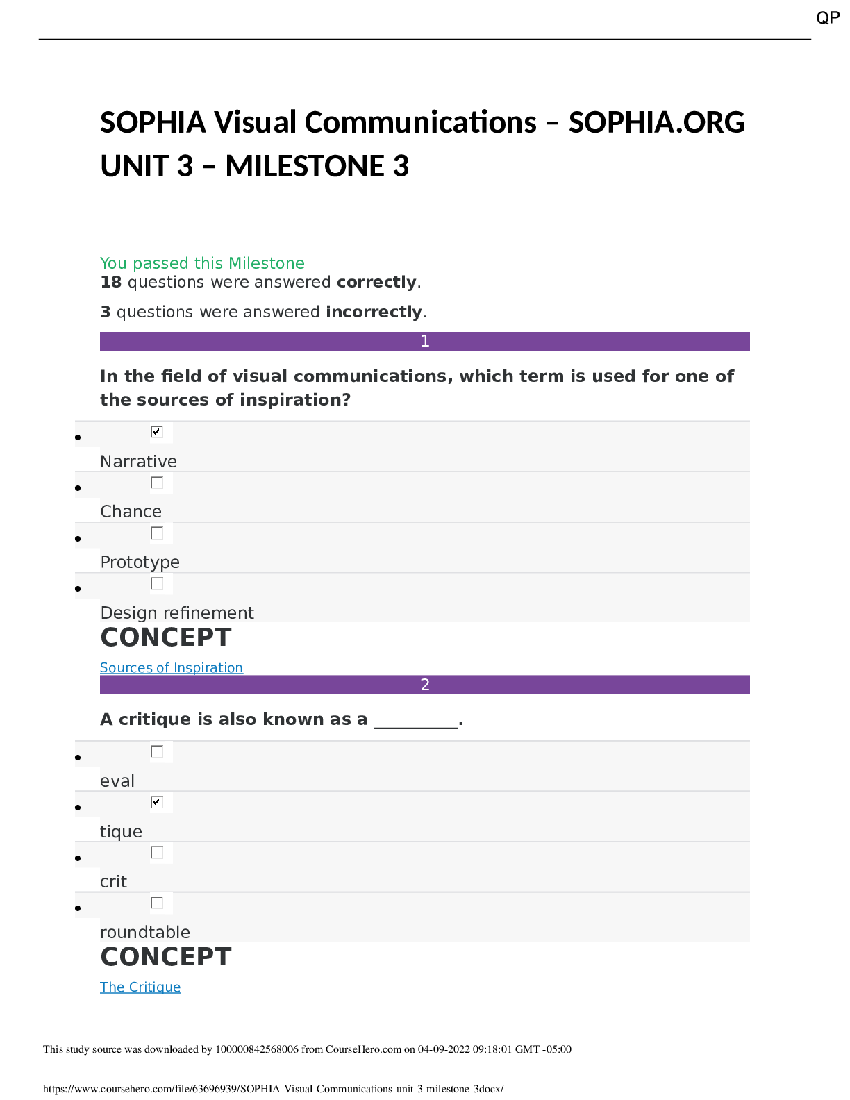
Based on this color wheel, which of the following is a secondary color?
• Green
• Yellow
• Blue
• Red
2
Which answer correctly describes the Postscript Type 1 font format?
• A font format that was developed by Apple and only works on Macintosh computers
• A font format developed by Microsoft, with versions available for both Windows and Macintosh computers
• The most recent font file format that works on both Windows and Macintosh computers
• The font format developed by Adobe that consists of two computer files
3
Which statement is correct as it relates to color use in Eastern culture?
• You would see black used at a funeral as a symbol of death and mourning.
• You would likely see red used at a traditional wedding, because it is a symbol of prosperity.
• At the turn of the New Year, you would see white, symbolic of good fortune.
• Green is often used during traditional holidays because it represents happiness.
4
What are some of the characteristics of the Blackletter typeface?
• Blacketter was based on ancient roman inscriptions and has a contrast between thick and thin strokes.
• Blacketter was popularized by the Bauhaus movement and includes thin serifs.
• Blacketter was based on written manuscripts and has elaborate, angular strokes.
• Blacketter originated in the 1400's and is known for its symmetry and strokes of even weight.
5
Which of the layout styles below is used in this image?
• Picture window
• Big type
• Frame
• Rebus
6
Which of the following best defines the subtractive color process?
• The mixing of subtractive color; using PMS color that is seen when light is absorbed or reflected by pigment.
• The mixing of powdered color; mixing color that is seen when light is absorbed or reflected by pigment.
• The mixing of color with pigment; subtractive color is seen when light is absorbed or reflected by pigment.
7
Which of the following color relationships is in this poster?
• Analogous color
• Split complementary color
• Complementary color
• Tertiary color
8
Examine the two type examples. They are shown in the same point size. Why do they look different?
• The fonts have two different X-heights.
• One of the fonts has been tracked very loosely.
• One of the fonts needs to be kerned.
9
The computer graphics and 3D software programs that are used to create characters, spaceships, and worlds for big-screen films use which color process?
• Additive
• Subtractive
• Four color
• Pantone
10
Which of the following terms describes the sketch in this photo?
• Wireframe drawing
• Modular drawing
• WYSIWYG drawing
• Bleed drawing
11
Which image contains a caption?
•
• B
•
12
Which of the following is the name of the type family shown?
• Semibold
• Italic
• Sans serif
• Baskerville
13
Comparing the International Style Movement to the de Stijl Style Movement, which statement is accurate?
• International Style is loose and decorative, while de Stijl Style is rigid and grid-based.
• The de Stijl Style and International Style Movements both originated in Switzerland.
• de Stijl and International Styles both focus on serif type arrangements.
• de Stijl focuses on primary colors, while the International Style is not tied to a color scheme.
14
Which of the following typographic features is present in this image?
• Sans serif typeface
• Italic typeface
• Slanted typeface
• Initial capital letter
15
Which two types of text alignment are used in this page layout?
• Right alignment and free form
• Free form and justified alignment
• Centered alignment and left alignment
• Centered alignment and justified alignment
16
Which of the following is the best description of WYSIWYG?
• Method used to choose the size and shape of the typeface to match marketing profiles
• Describes the ability to see type and image detail on a computer screen that is the equivalent of the printed version
• Used in the Gutenberg Bible to create layouts for better readability
• Used primarily to produce golden section proportions in design projects
17
Why is color temperature important in design?
• Color temperature changes the mood of the design.
• Color temperature changes the balance of the design.
• Color temperature changes the elements of the design.
• Color temperature changes the principles of the design.
18
Which type alignments are easiest to read?
• Right and justified alignments
• Left and centered alignments
• Right and centered alignments
• Left and justified alignments
19
Which statement correctly explains kerning?
• Kerning is the spacing across a range of words in body copy.
• Kerning is the white space between two lines of type.
• Kerning is the version of a typeface that is wider than its regular form.
• Kerning is the white space between two letters.
20
Which of the following describes type weight?
• The width of a letter stroke
• The x-height of a letter stroke
• The thickness of a letter stroke
• The baseline of a letter stroke
21
When creating a graphic on your computer screen for a website, which color system would you use?
• Hexadecimal color
• CMYK
• PMS
• Subtractive color
22
Which one of the following items describes a component contained in this newspaper design?
• Monochromatic
• Display type
• Script typeface
• Right aligned type
23
Mixing dabs of red and black acrylic paint, each straight from the tube, will result in a __________ of red.
• complement
• shade
• tone
• tint
24
When laying out a project, why is it important to carefully consider spacing, typeface and posture?
• These choices enable designers to generate the most creative design possible.
• These choices guide the eye to focus on the most important details first.
• These choices produce easy reading, which is always the goal of design.
• These choices prevent designers from placing text too close together.
[Show More]










![Preview of eBook [PDF] Practice Makes Perfect Spanish Conversation 4th Edition By Jean Yates](https://browseimages.nyc3.digitaloceanspaces.com/paper-images/2024/Aug/29/vc91YI5f2024-08-29-08-3966d0098174cfb.png)