University of California, Berkeley
DATA MISC
Lab 09
August 6, 2019
[64]: # Initialize OK
from client.api.notebook import Notebook
ok = Notebook('lab09.ok')
======================================================
...
University of California, Berkeley
DATA MISC
Lab 09
August 6, 2019
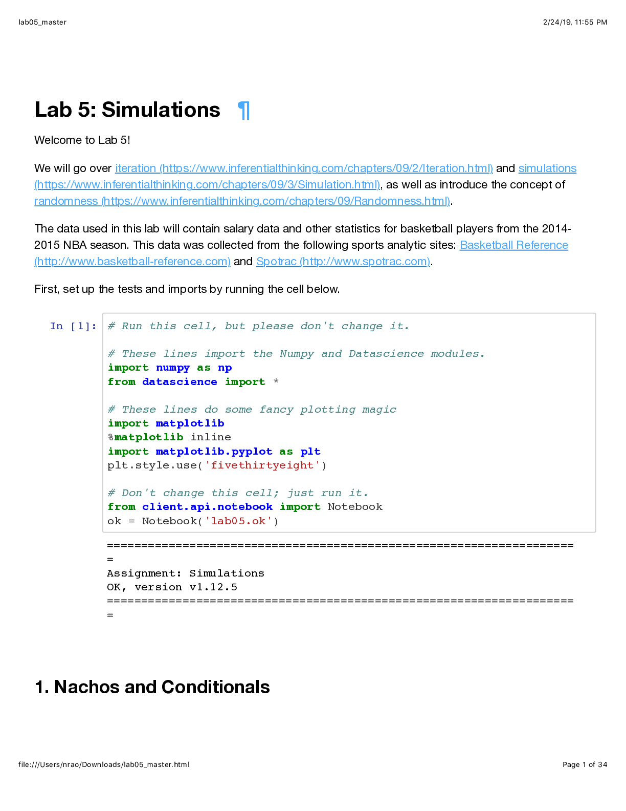
[64]: # Initialize OK
from client.api.notebook import Notebook
ok = Notebook('lab09.ok')
=====================================================================
Assignment: Normal Distribution and Variance of Sample Means
OK, version v1.12.5
=====================================================================
1 Lab 9: Normal Distribution and Variance of Sample Means
Welcome to Lab 9!
In today’s lab, we will learn about the variance of sample means as well as the normal distribution.
[ ]: # Run this cell, but please don't change it.
# These lines import the Numpy and Datascience modules.
import numpy as np
from datascience import *
# These lines do some fancy plotting magic.
import matplotlib
%matplotlib inline
import matplotlib.pyplot as plots
plots.style.use('fivethirtyeight')
import warnings
warnings.simplefilter('ignore', FutureWarning)
# These lines load the tests.
from client.api.notebook import Notebook
ok = Notebook('lab09.ok')
_ = ok.submit()
=====================================================================
Assignment: Normal Distribution and Variance of Sample Means
1
OK, version v1.12.5
=====================================================================
2 1. Normal Distributions
When we visualize the distribution of a sample, we are often interested in the mean and the standard deviation of the sample (for the rest of this lab, we will abbreviate “standard deviation” as
“SD”). These two summary statistics can give us a bird’s eye view of the distribution, by letting
us know where the distribution sits on the number line and how spread out it is, respectively.
We would like to use linear regression to make predictions, but that won’t work well if the
data aren’t roughly linearly related. To check that, we should look at the data.
Question 1.1. The next cell loads the table births from lecture, which is a large random sample
of US births and includes information about mother-child pairs. Plot the distribution of mother’s
ages from the table. Don’t change the last line, which will plot the mean of the sample on the
distribution itself.
[14]: births = Table.read_table('baby.csv')
births.hist("Maternal Age")
plots.scatter(np.mean(births.column("Maternal Age")), 0, color='red', s=50);
2
[15]: births
[15]: Birth Weight | Gestational Days | Maternal Age | Maternal Height | Maternal
Pregnancy Weight | Maternal Smoker
120 | 284 | 27 | 62 | 100
| False
113 | 282 | 33 | 64 | 135
| False
128 | 279 | 28 | 64 | 115
| True
108 | 282 | 23 | 67 | 125
| True
136 | 286 | 25 | 62 | 93
| False
138 | 244 | 33 | 62 | 178
| False
132 | 245 | 23 | 65 | 140
| False
120 | 289 | 25 | 62 | 125
| False
143 | 299 | 30 | 66 | 136
| True
140 | 351 | 27 | 68 | 120
| False
... (1164 rows omitted)
From the plot above, we can see that the mean is the center of gravity or balance point of
the distribution. If you cut the distribution out of cardboard, and then placed your finger at the
mean, the distribution would perfectly balance on your finger. Since the distribution above is right
skewed (which means it has a long right tail), we know that the mean of the distribution is larger
than the median, which is the “halfway” point of the data.
Question 1.2. Run the following cell to compare the mean (red) and median (green) of the
distribution of mothers ages.
[16]: births.hist("Maternal Age")
plots.scatter(np.mean(births.column("Maternal Age")), 0, color='red', s=50);
plots.scatter(np.median(births.column("Maternal Age")), 0, color='green', s=50);
3
We are also interested in the standard deviation of mother’s ages. The SD gives us a sense
of how variable mother’s ages are around the average mother’s age. If the SD is large, then the
mother’s heights should spread over a large range from the mean. If the SD is small, then the
mother’s heights should be tightly clustered around the average mother height. The standard
deviation is calculated as follows:
s =
vuut
1N
N∑i=1
(xi - m)2
The (Greek letter sigma) is the SD and the (Greek letter mu) is the mean. This formula basically
says that the SD of an array is defined as the root mean square of deviations from average.
Question 1.3. Run the cell below to see the width of one SD (blue) from the sample mean (red)
plotted on the histogram of maternal ages.
[17]: age_mean = np.mean(births.column("Maternal Age"))
age_sd = np.std(births.column("Maternal Age"))
births.hist("Maternal Age")
plots.scatter(age_mean, 0, color='red', s=50);
plots.scatter(age_mean+age_sd, 0, marker='^', color='blue', s=50);
plots.scatter(age_mean-age_sd, 0, marker='^', color='blue', s=50);
4
In this histogram, the standard deviation is not easy to identify just by looking at the graph.
However, the distributions of some variables allow us to easily spot the standard deviation on
the plot. For example, if a sample follows a normal distribution, the standard deviation is easily
spotted at the point of inflection of the distribution.
Question 1.4. Run the following code to examine the distribution of a variable, maternal heights,
which is roughly normally distributed. We’ll plot the standard deviation on the histogram, as
before - notice where one standard deviation (blue) away from the mean (red) falls on the plot.
[18]: height_mean = np.mean(births.column("Maternal Height"))
height_sd = np.std(births.column("Maternal Height"))
births.hist("Maternal Height", bins=np.arange(55,75,1))
plots.scatter((height_mean), 0, color='red', s=50);
plots.scatter(height_mean+height_sd, 0, marker='^', color='blue', s=50);
plots.scatter(height_mean-height_sd, 0, marker='^', color='blue', s=50);
5
We don’t always know how a variable will be distributed, and making assumptions about
whether or not a variable will follow a normal distribution is dangerous. However, the Central
Limit Theorem defines one distribution that always follows a normal distribution. The distribution of means of many large random samples drawn with replacement from a single distribution
(regardless of the distribution’s original shape) will be normally distributed. Remember that the
Central Limit Theorem refers to the distribution of a statistic calculated from a distribution, not
the distribution of the original sample or population. If this is confusing, ask a TA!
The next section will explore distributions of sample means, and you will see how the standard
deviation of these distributions depends on sample sizes.
3 2. Variability of the Sample Mean
By the Central Limit Theorem, the probability distribution of the mean of a large random sample is
roughly normal. The bell curve is centered at the population mean. Some of the sample means are
higher and some are lower, but the deviations from the population mean are roughly symmetric
on either side, as we have seen repeatedly. Formally, probability theory shows that the sample
mean is an unbiased estimate of the population mean.
In our simulations, we also noticed that the means of larger samples tend to be more tightly
clustered around the population mean than means of smaller samples. In this section, we will
quantify the variability of the sample mean and develop a relation between the variability and the
sample size. For the remainder of this lab, we will use the abbreviation "SD" to refer to "standard
deviation."
Let’s take a look at the salaries of employees of the City of San Francisco in 2014. The mean
salary reported by the city government was about $75,463.92.
6
Note: If you get stuck on any part of this lab, please refer to chapter 14 of the textbook.
[19]: salaries = Table.read_table('sf_salaries_2014.csv').select("salary")
salaries
[19]: salary
... (38113 rows omitted)
[20]: salary_mean = np.mean(salaries.column('salary'))
print('Mean salary of San Francisco city employees in 2014: ', salary_mean)
Mean salary of San Francisco city employees in 2014: 75463.91814023031
[21]: salaries.hist('salary', bins=np.arange(0, 300000+10000*2, 10000))
plots.scatter(salary_mean, 0, marker='^', color='red', s=100);
plots.title('2014 salaries of city of SF employees');
7
Clearly, the population does not follow a normal distribution. Keep that in mind as we
progress through these exercises.
Let’s take random samples with replacement and look at the probability distribution of the sample mean. As usual, we will use simulation to get an empirical approximation to this distribution.
Question 2.1. Define a function one_sample_mean. It should take as arguments the name of a
table, the label of the column containing the variable, and a sample size. It should sample with
replacement from the table and return the mean of the label column of the sample.
[22]: def one_sample_mean(table, label, sample_size):
new_sample = table.sample(sample_size)
new_sample_mean = np.mean(new_sample.column(label))
return new_sample_mean
[23]: ok.grade("q2_1");
~~~~~~~~~~~~~~~~~~~~~~~~~~~~~~~~~~~~~~~~~~~~~~~~~~~~~~~~~~~~~~~~~~~~
[Show More]