San Diego State University
MATH 52.3 online hw with solutions
Course: Math 5 (1) Assignment: 2.3
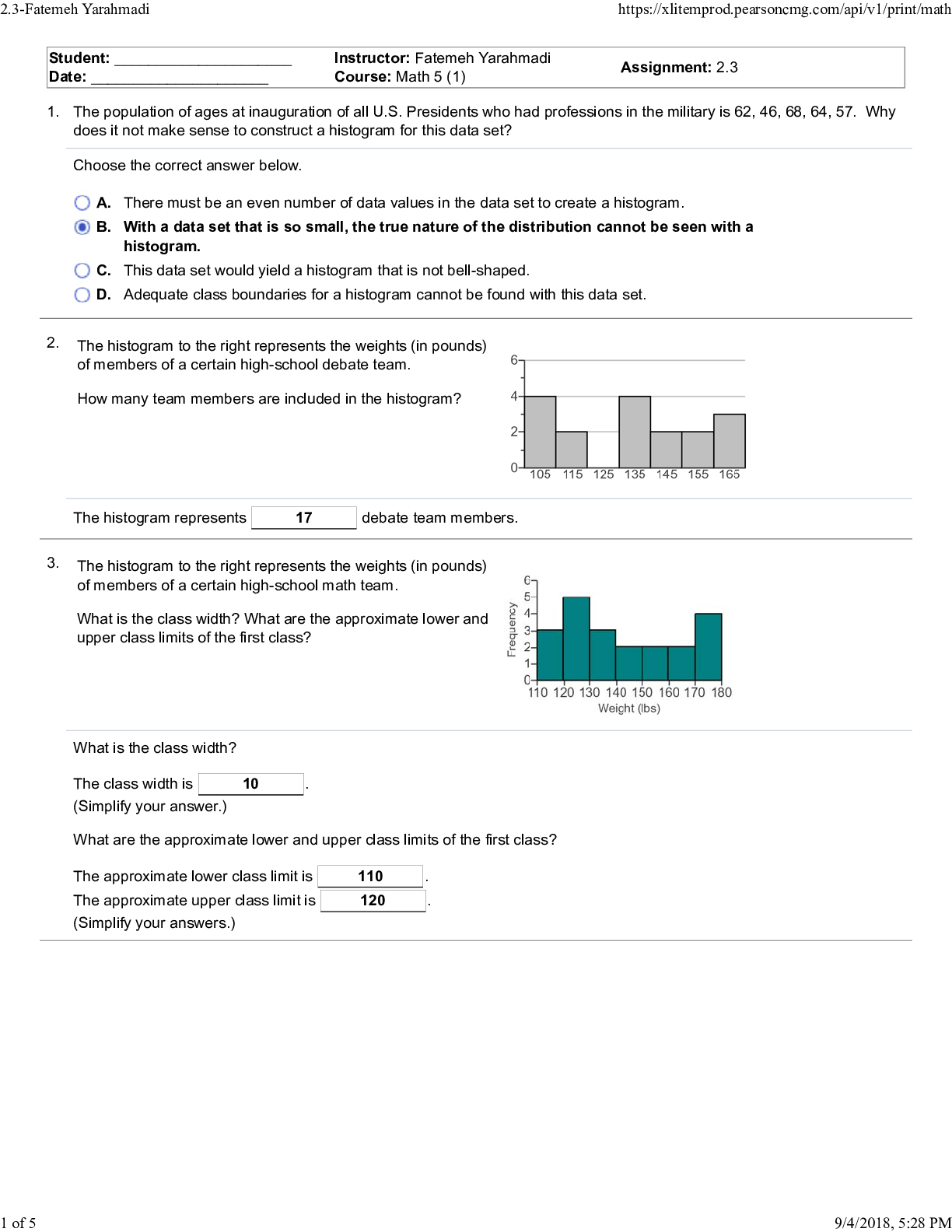
The population of ages at inauguration of all U.S. Presidents who had professions in the military is 62, 46, 68, 64, 57.
...
San Diego State University
MATH 52.3 online hw with solutions
Course: Math 5 (1) Assignment: 2.3
The population of ages at inauguration of all U.S. Presidents who had professions in the military is 62, 46, 68, 64, 57. Why
does it not make sense to construct a histogram for this data set?
Choose the correct answer below.
A. There must be an even number of data values in the data set to create a histogram.
B. With a data set that is so small, the true nature of the distribution cannot be seen with a
histogram.
C. This data set would yield a histogram that is not bell-shaped.
D. Adequate class boundaries for a histogram cannot be found with this data set.
The histogram to the right represents the weights (in pounds)
of members of a certain high-school team. debate
How many team members are included in the histogram?
The histogram represents team members. 17 debate
The histogram to the right represents the weights (in pounds)
of members of a certain high-school team. math
What is the class width? What are the approximate lower and
upper class limits of the first class?
What is the class width?
The class width is
(Simplify your answer.) . 10
What are the approximate lower and upper class limits of the first class?
The approximate lower class limit is . 110
The approximate upper class limit is
(Simplify your answers.) . 120
2.3-Fatemeh Yarahmadi https://xlitemprod.pearsoncmg.com/api/v1/print/math
1 of 5 9/4/2018, 5:28 PM
4.
5.
The frequency distribution below represents frequencies of
actual low temperatures recorded during the course of a
31-day month. Use the frequency distribution to construct a
histogram. Do the data appear to have a distribution that is
approximately normal? Choose the correct histogram below.
A. B.
C. D.
Do the data appear to have a distribution that is
approximately normal?
A. Yes, it is approximately normal.
B. No, it is approximately uniform.
C. No, it is completely erratic.
D. No, it is not at all symmetric.
The histogram to the right represents the weights (in pounds)
of members of a certain high-school team. debate
What is the class width? What are the approximate lower and
upper class limits of the first class?
What is the class width?
The class width is
(Simplify your answer.) . 20
What are the approximate lower and upper class limits of the first class?
The approximate lower class limit is . 110
The approximate upper class limit is
(Simplify your answers.) . 130
Class Frequency
A 39 - 44
B 45 - 50
C 51 - 56
D 57 - 62
E 63 - 68
F 69 - 74
G 75 - 80
1378822
2.3-Fatemeh Yarahmadi https://xlitemprod.pearsoncmg.com/api/v1/print/math
2 of 5 9/4/2018, 5:28 PM
6.
The table below shows the magnitudes of the earthquakes
that have occurred in the past 10 years.
Use the frequency distribution to construct a histogram.
Using a loose interpretation of the requirements for a normal
distribution, does the histogram appear to depict data that
have a normal distribution? Why or why not? Construct the histogram. Choose the correct graph below.
A.
B.
C.
Does the histogram appear to depict data that have a
normal distribution?
A. The histogram does not appear to depict
a normal distribution. The frequencies
generally decrease to a maximum and
then increase, and the histogram is
symmetric.
B. The histogram appears to roughly
approximate a normal distribution.
The frequencies generally increase to
a maximum and then decrease, and
the histogram is symmetric.
C. The histogram does not appear to depict
a normal distribution. The frequencies
generally increase and the histogram is
symmetric.
D. The histogram appears to roughly
approximate a normal distribution. The
frequencies generally decrease to a
minimum and then increase.
Earthquake magnitude Frequency
5.0-5.9
6.0-6.9
7.0-7.9
8.0-8.9
9.0-9.9
67
11
62
2.3-Fatemeh Yarahmadi https://xlitemprod.pearsoncmg.com/api/v1/print/math
3 of 5 9/4/2018, 5:28 PM
7.
The table below shows the frequency distribution of red
blood cell counts in males. 83
Use the frequency distribution to construct a histogram.
Using a loose interpretation of the requirements for a normal
distribution, does the histogram appear to depict data that
have a normal distribution? Why or why not? Choose the correct histogram below.
A.
B.
C.
Does the histogram appear to depict data that have a
normal distribution?
A. The histogram does not appear to depict
a normal distribution. The frequencies
generally decrease to a maximum and
then increase, and the histogram is
symmetric.
B. The histogram appears to roughly
approximate a normal distribution.
The frequencies generally increase to
a maximum and then decrease, and
the histogram is symmetric.
C. The histogram appears to roughly
approximate a normal distribution. The
frequencies generally decrease to a
minimum and then increase.
D. The histogram does not appear to depict
a normal distribution. The frequencies
generally increase and the histogram is
symmetric.
8.
Red blood cell count Frequency
3.00-3.49
3.50-3.99
4.00-4.49
4.50-4.99
5.00-5.49
5.50-5.99
6.00-6.49
6.50-6.99
17
14
17
19
13
93
(1) frequency
survey
data set
graph
Fill in the blank.
The heights of the bars of a histogram correspond to _______ values.
The heights of the bars of a histogram correspond to (1) values.
2.3-Fatemeh Yarahmadi https://xlitemprod.pearsoncmg.com/api/v1/print/math
4 of 5 9/4/2018, 5:28 PM
9.
10.
11.
(1) shape of the distribution
bias
context
type
Fill in the blank.
A histogram aids in analyzing the _______ of the data.
A histogram aids in analyzing the (1) of the data.
(1) polygon
normal distribution
relative frequency
back-to-back
Fill in the blank.
A _______ histogram has the same shape and horizontal scale as a histogram, but the vertical scale is marked with
relative frequencies instead of actual frequencies.
A (1) histogram has the same shape and horizontal scale as a histogram but the vertical scale is marked
with relative frequencies instead of actual frequencies.
(1) outlier
relative frequency
normal
polygon
Fill in the blank.
A(n) _______ distribution has a "bell" shape.
A(n) (1) distribution has a "bell" shape.
2.3-Fatemeh Yarahmadi https://xlitemprod.pearsoncmg.com/api/v1/print/math
5 of 5 9/4/2018, 5:28 PM
[Show More]

.png)
 2e Peter Olver, Chehrzad Shakiban.png)