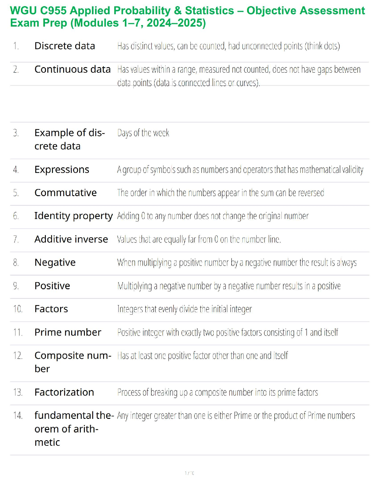
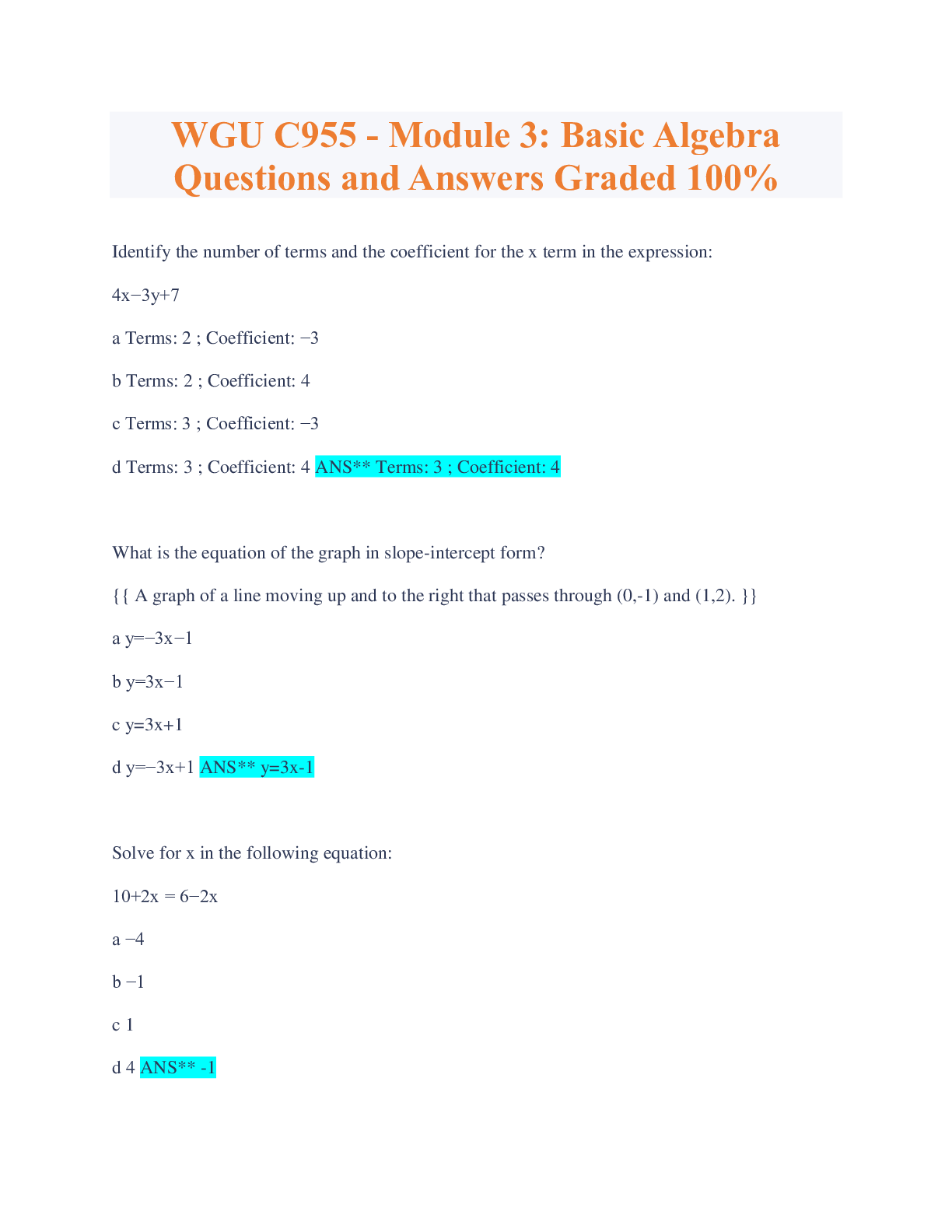
WGU C955 - Module 5: Descriptive
Statistics for Two Variables, Top Exam
Questions and answers, rated A+
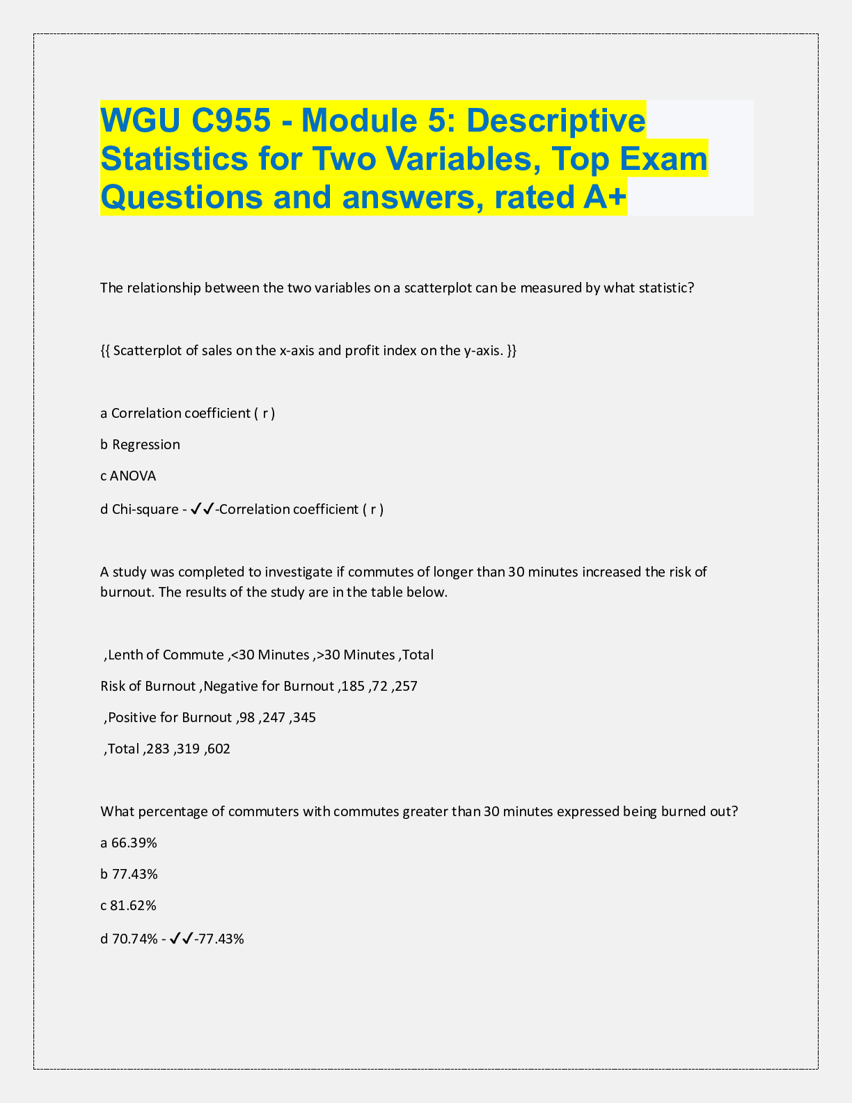
The relationship between the two variables on a scatterplot can be measured by what statistic?
{{ Scatterplot
...
WGU C955 - Module 5: Descriptive
Statistics for Two Variables, Top Exam
Questions and answers, rated A+
The relationship between the two variables on a scatterplot can be measured by what statistic?
{{ Scatterplot of sales on the x-axis and profit index on the y-axis. }}
a Correlation coefficient ( r )
b Regression
c ANOVA
d Chi-square - ✔✔-Correlation coefficient ( r )
A study was completed to investigate if commutes of longer than 30 minutes increased the risk of
burnout. The results of the study are in the table below.
,Lenth of Commute ,<30 Minutes ,>30 Minutes ,Total
Risk of Burnout ,Negative for Burnout ,185 ,72 ,257
,Positive for Burnout ,98 ,247 ,345
,Total ,283 ,319 ,602
What percentage of commuters with commutes greater than 30 minutes expressed being burned out?
a 66.39%
b 77.43%
c 81.62%
d 70.74% - ✔✔-77.43%
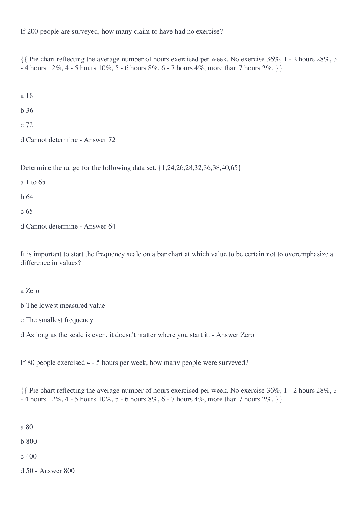
Describe the relationship of the two variables on the scatterplot.
{{ Scatterplot displaying data points with advertising dollars on the x-axis and units sold on the y-axis.
The data points are tightly clustered in a pattern that slopes upward from right to left in a non-linear
fashion. }}
a Weak negative
b Strong negative
c Weak/No relationship
d Non-linear/Curved relationship - ✔✔-Non-linear/Curved relationship
What percentage of connections using Service Provider A were suspicious?
Web Hosting Service
Service Provider A Service Provider B Total
Web Server Safe Connections 87 14 101
Suspicious Connections 37 89 126
Total 124 103 227
a 13.6%
b 29.8%
c 70.2%
d 86.4% - ✔✔-29.8%
Out of the total number of connections, what percentage of safe connections were reported by Service
Provider A?
Web Hosting Service
Service Provider A Service Provider B Total
Web Server Safe Connections 87 14 101
Suspicious Connections 37 89 126
Total 124 103 227
a 6.2%
b 16.3%
c 38.3%
d 39.2% - ✔✔-38.3%
In the side-by-side box plot below, gender represents what type of variable?
{{ Side by side box plots comparing the hourly wages of both males and females. Gender is on the y-axis
}}
a Quantitative variable
b Response variable
c Controlled variable
d Categorical variable - ✔✔-Categorical variable
What percentage of the students who took the eight-week online course were unsuccessful in passing
the certification exam?
Successful Unsuccessful Total
Eight Week Online Certification Course 118 26 144
Self-directed Certification Study Program 42 14 56
Total 160 40 200
a 7.3%
b 18.1%
c 20%
d 25.6% - ✔✔-18%
In the side-by-side box plot below, hourly wage represents what type of variable?
{{ Side by side box plots comparing hourly wages of both males and females. Hourly wage is on the x�axis. }}
a Response variable
b Categorical variable
c Explanatory variable
d Qualitative variable - ✔✔-Response variable
What is the joint frequency of safe connections for Service Provider A?
Web Hosting Service
Service Provider A Service Provider B Total
Web Server Safe Connections 87 14 101
Suspicious Connections 37 89 126
Total 124 103 227
a 14
b 37
c 87
d 89 - ✔✔-87
What type of correlation is shown in the scatterplot?
{{ Scatterplot displaying data points distributed in a line descending from upper left to lower right. }}
a Perfectly linear positive
b Perfectly linear negative
c Strong but not perfectly linear positive
d Strong but not perfectly linear negative - ✔✔-Perfectly linear negative
A study was completed to investigate if commutes of longer than 30 minutes increased the risk of
burnout. The results of the study are in the table below.
Lenth of Commute
<30 Minutes >30 Minutes Total
Risk of Burnout Negative for Burnout 185 72 257
Positive for Burnout 98 247 345
Total 283 319 602
What percentage of commuters that did not report feeling burned out have a commute of fewer than
30 minutes?
a 78.61%
b 71.98%
c 68.24%
d 80.78% - ✔✔-71.98%
On this scatterplot, what do the five points in the upper left corner near (3,12) represent?
{{ Scatterplot displaying data points in a line from lower left to upper right, with a grouping of data
points in the upper left quadrant. }}
a Outlier
b Cluster
c Trend
d Correlation - ✔✔-Cluster
What does the point of (4,12) represent on this scatterplot?
{{ Scatterplot displaying data points distributed in a line from lower left to upper right, with one data
point in the upper left quadrant. }}
a Outlier
b Cluster
c Trend
d Correlation - ✔✔-Outlier
In the scatterplot, sales represent what type of variable?
{{ Scatterplot of sales on the x-axis and profit index on the y-axis. }}
a Qualitative variable
b Explanatory variable
c Response variable
d Controlled variable - ✔✔-Response variable
What is the marginal frequency of suspicious connections?
Web Hosting Service
Service Provider A Service Provider B Total
Web Server Safe Connections 87 14 101
Suspicious Connections 37 89 126
Total 124 103 227
a 101
b 126
c 124
d 103 - ✔✔-126
If both variables are quantitative, what graphical display can show whether there is a relationship
between the variables, the strength of the relationship, and whether it is positive or negative?
a Histogram
b Scatterplot
c Two-way frequency table
d Gantt chart - ✔✔-Scatterplot
What type of correlation is shown in the scatterplot?
{{ Scatterplot illustrating data points widely distrubted with no apparent trend. }}
a Positive correlation
b Negative correlation
c Non-linear correlation
d No correlation - ✔✔-No correlation
What percentage of connections using Service Provider B were suspicious?
Web Hosting Service
Service Provider A Service Provider B Total
Web Server Safe Connections 87 14 101
Suspicious Connections 37 89 126
Total 124 103 227
a 13.9%
b 29.4%
c 70.6%
d 86.4% - ✔✔-86.4%
What percentage of all students were successful at passing the certification exam by taking the Self�directed Certification Study Program?
Successful Unsuccessful Total
Eight Week Online Certification Course 118 26 144
Self-directed Certification Study Program 42 14 56
Total 160 40 200
a 7%
b 13%
c 21%
d 59% - ✔✔-21%
What type of correlation is shown in the scatterplot?
{{ Scatterplot displaying data points distributed in an upside-down arc. }}
a Positive correlation
b Negative correlation
c Non-linear correlation
d No correlation - ✔✔-Non-linear correlation
Use the table below to answer the following question.
Fertilizer Type
Fertilizer A Fertilizer B Total
Crop Yield <100 bushels per acre 84 149 233
>100 bushels per acre 197 74 271
Total 281 223 504
What percentage of crops fertilized with Fertilizer A had a crop yield of greater than 100 bushels per
acre?
a 29.9%
b 33.2%
c 66.8%
d 70.1% - ✔✔-70.1%
If both variables are categorical, what is the best method to display the data?
a Two-way frequency table
b Scatterplot
c Side-by-side box plot
d Histogram - ✔✔-Two-way frequency table
A scatterplot is a type of graph that is represented on what type of plane?
a Topological plane
b Coordinate plane
c Projective plane
d Hyperplane - ✔✔-Coordinate plane
A side-by-side box plot is an effective method of displaying what types of variables?
a Two categorical variables
b Two quantitative variables
c Two explanatory variables
d One categorical and one quantitative variable - ✔✔-One categorical and one quantitative variable
Use the table below to answer the following question.
Department
Operations Sales Tota
[Show More]




.png)