Economics > QUESTIONS & ANSWERS > California State University, San Marcos - ECO 201ECO 201 & 202 Quizz (All)
California State University, San Marcos - ECO 201ECO 201 & 202 Quizz
Document Content and Description Below
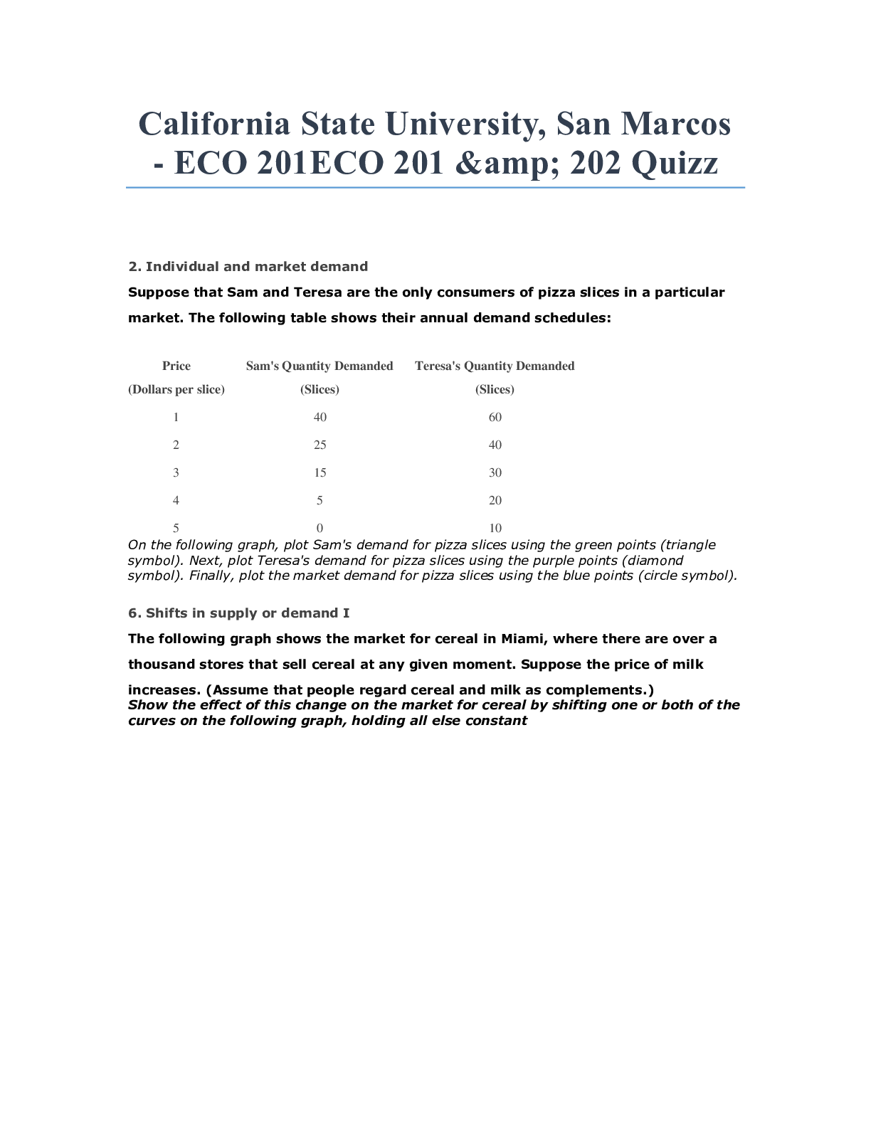
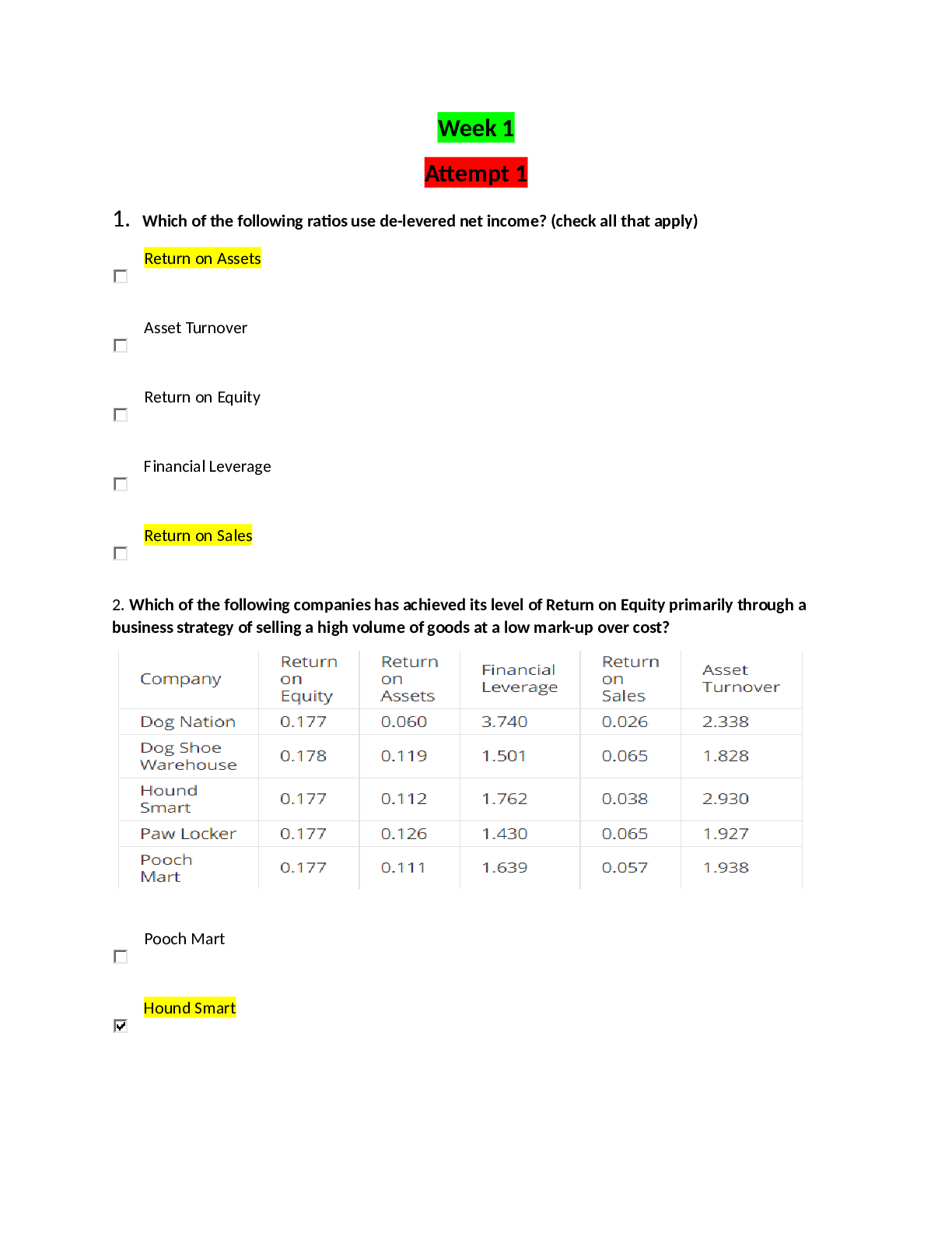
2. Individual and market demand Suppose that Sam and Teresa are the only consumers of pizza slices in a particular market. The following table shows their annual demand schedules: Price Sam's Quan... tity Demanded Teresa's Quantity Demanded (Dollars per slice) (Slices) (Slices) 1 40 60 2 25 40 3 15 30 4 5 20 5 0 10 On the following graph, plot Sam's demand for pizza slices using the green points (triangle symbol). Next, plot Teresa's demand for pizza slices using the purple points (diamond symbol). Finally, plot the market demand for pizza slices using the blue points (circle symbol). 6. Shifts in supply or demand I The following graph shows the market for cereal in Miami, where there are over a thousand stores that sell cereal at any given moment. Suppose the price of milk increases. (Assume that people regard cereal and milk as complements.) Show the effect of this change on the market for cereal by shifting one or both of the curves on the following graph, holding all else constant • Price of inputs • Production technology • Number of producers • Expectations of producers 5. A change in supply versus a change in quantity supplied 5. A change in supply versus a change in quantity supplied The following calculator shows the supply curve for sedans in an imaginary market. For simplicity, assume that all sedans are identical and sell for the same price. Two factors that affect the supply of sedans are the level of technical knowledge—in this case, the speed with which manufacturing robots can fasten bolts, or robot speed—and the wage rate that auto manufacturers must pay their employees. Initially, the graph shows the supply curve when robots can fasten 2,500 bolts per hour and autoworkers earn $25 per hour. Use the graph input tool to help you answer the following questions. You will not be graded on any changes you make to this graph. Note: Once you enter a value in a white field, the graph and any corresponding amounts in each grey field will change accordingly. Consider the previous graph. Suppose that the price of a sedan decreases from $31,000 to $26,000. This would cause the quantity supplied of sedans to decrease, which is reflected on the graph by a movement along • Following a technological decline—for example, a decrease in the speed with which robots can attach bolts to cars—there is a leftward shift of the supply curve because the technological decline makes cars more expensive to build . If technology declines, fewer goods can be produced with the same number of inputs. In this case, slower robots produce fewer automobiles each month, which results in a lower quantity supplied at each price. Graphically, a decrease in quantity at every price (as opposed to a decrease due to a change in price) is shown as a leftward shift of the supply curve. 6. Shifts in supply or demand I The following graph shows the market for hot dogs in Denver, where there are over a thousand hot dog stands at any given moment. Suppose the price of hamburgers decreases. (Assume that people regard hot dogs and hamburgers as substitutes.) Show the effect of this change on the market for hot dogs by shifting one or both of the curves on the following graph, holding all else constant. Factors Affecting Supply • Price of inputs • Production technology • Number of producers • Expectations of producers 7. Shifts in supply or demand II The following graph shows the market for hot dogs in Chicago, where there are over a thousand hot dog stands at any given moment. Suppose the number of hot dog stands increases significantly. Show the effect of this change on the market for hot dogs by shifting one or both of the curves on the following graph, holding all else constant • Price of a related good (complement or substitute) • Income of consumers • Tastes of consumers • Number of consumers • Expectations of consumers 7. Shifts in supply or demand II The following graph shows the market for hot dogs in Chicago, where there are over a thousand hot dog stands at any given moment. Suppose the number of hot dog stands increases significantly. Show the effect of this change on the market for hot dogs by shifting one or both of the curves on the following graph, holding all else constant. • Price of a related good (complement or substitute) • Income of consumers • Tastes of consumers • Number of consumers • Expectations of consumers 7. Shifts in supply or demand II The following graph shows the market for cakes in Miami, where there are over a thousand bakeries at any given moment. Suppose the price of flour, a major ingredient in cakes, suddenly decreases. Show the effect of this change on the market for cakes by shifting one or both of the curves on the following graph, holding all else constant. Factors Affecting Demand • Price of a related good (complement or substitute) • Income of consumers • Tastes of consumers • Number of consumers • Expectations of consumers 9. Market equilibrium and disequilibrium The following graph shows the monthly demand and supply curves in the market for teapots. Use the graph input tool to help you answer the following questions. Enter an amount into the Price field to see the quantity demanded and quantity supplied at that price. You will not be graded on any changes you make to this graph. The equilibrium price in this market is $50 per teapot, and the equilibrium quantity is 250 teapots bought and sold per month. Points: Complete the following table by indicating at each price whether there is a shortage or surplus in the market, the amount of that shortage or surplus, and whether this places upward or downward pressure on prices. • • At a price of $60 per teapot, consumers demand 125 teapots per month, but producers supply 270 teapots per month. Therefore, supply exceeds demand by 145 teapots per month. Because producers want to sell more teapots than consumers are willing to buy at that price, there will be a surplus (excess supply) of teapots, and sellers will start lowering prices to sell off their excess inventory. Thus, the surplus (excess supply) will put downward pressure on the price of a teapot, causing it to fall. 9. Market equilibrium and disequilibrium The following graph shows the monthly demand and supply curves in the market for keyboards. Use the graph input tool to help you answer the following questions. Enter an amount into the Price field to see the quantity demanded and quantity supplied at that price. You will not be graded on any changes you make to this graph Created with Raphaël 2.1.2 Graph Input Tool Complete the following table by indicating at each price whether there is a shortage or surplus in the market, the amount of that shortage or surplus, and whether this places upward or downward pressure on prices. At a price of $42 per keyboard, consumers demand 300 keyboards per month, but producers supply 700 keyboards per month. Therefore, supply exceeds demand by 400 keyboards per month. Because producers want to sell more keyboards than consumers are willing to buy at that price, there will be a surplus (excess supply) of keyboards, and sellers will start lowering prices to sell off their excess inventory. Thus, the surplus (excess supply) will put downward pressure on the price of a keyboard, causing it to fall. 10. Determining consumers' and producers' surplus Identify whether each statement in the following table best illustrates the concept of consumers’ surplus, producers’ surplus, or neither. Statement Consumers’ Surplus Producers’ Surplus Neither Even though I was willing to pay up to $120 for a used laptop, I bought a used laptop for only $115. Even though I was willing to pay up to $65 for a used textbook, and even though the seller was willing to go as low as $55 in order to sell it, we couldn't reach a deal because the government imposed a tax of $17 on the sale of textbooks. I sold a watch for $58, even though I was willing to go as low as $50 in order to sell it. 11. Equilibrium in terms of consumers' and producers' surplus The following graph shows supply and demand in the market for computer keyboards. Use the black point (cross symbol) to indicate the equilibrium price and quantity of computer keyboards. Then use the green point (triangle symbol) to fill the area representing consumers’ surplus, and use the purple point (diamond symbol) to fill the area representing producers’ surplus . Therefore, total surplus equals . 12. A supply and demand puzzle The following graph shows the market for roses in 2007. Between 2007 and 2008, the equilibrium quantity of roses remained constant, but the equilibrium price of roses increased. From this, you can conclude that between 2007 and 2008, the supply of roses decreased , and the demand for roses increased 13. Another supply and demand puzzle The market price of calzones in a college town increased recently, and the students in an economics class are debating the cause of the price increase. Some students suggest that the price increased because several pizza parlors in the area have recently gone out of business. Other students attribute the increase in the price of calzones to a recent increase in college student enrollment. The first group of students thinks the increase in the price of calzones is due to the fact that several pizza parlors in the area have recently gone out of business. On the following graph, adjust the supply and demand curves to illustrate the first group’s explanation for the increase in the price of calzones The second group of students attributes the increase in the price of calzones to the increase in college student enrollment. On the following graph, adjust the supply and demand curves to illustrate the second group’s explanation for the increase in the price of calzones Suppose that both of the causes suggested by the students are partly responsible for the increase in the price of calzones. Based on your analysis of the explanations offered by the two groups of students, how would you figure out which of the possible causes is the dominant cause of the increase in the price of calzones? If the price increase was large, then the supply shift in the market for calzones must have been larger than the demand shift. If the equilibrium quantity of calzones decreases, then the demand shift in the market for calzones must have been larger than the supply shift. Whichever change occurred first must have been the primary cause of the change in the price of calzones. If the equilibrium quantity of calzones decreases, then the supply shift in the market for calzones must have been larger than the demand shift. Points: 1 / 1 When demand and supply shift in opposite directions, the change in price is clear, but the quantity shift is determined by which curve moves more. The following graphs both illustrate an increase in demand and a decrease in supply—causing the equilibrium price to increase—but the magnitudes of the shifts vary, causing different results for the change in the equilibrium quantity: 13. Another supply and demand puzzle The market price of pizzas in a college town decreased recently, and the students in an economics class are debating the cause of the price decrease. Some students suggest that the price decreased because a new type of pizza oven allows pizza shops to create a pizza in half the time. Other students attribute the decrease in the price of pizzas to a recent decrease in the price of hamburgers at local burger joints. Everyone agrees that the decrease in the price of hamburgers was caused by a recent decrease in the price of ground beef, which is not generally used in making pizzas. Assume that pizza parlors and burger joints are entirely separate entities—that is, there aren't places that serve both pizzas and hamburgers. The first group of students thinks the decrease in the price of pizzas is due to the fact that a new type of pizza oven allows pizza shops to create a pizza in half the time. On the following graph, adjust the supply and demand curves to illustrate the first group’s explanation for the decrease in the price of pizzas. The second group of students attributes the decrease in the price of pizzas to the decrease in the price of hamburgers at local burger joints. On the following graph, adjust the supply and demand curves to illustrate the second group’s explanation for the decrease in the price of pizzas. Suppose that both of the causes suggested by the students are partly responsible for the decrease in the price of pizzas. Based on your analysis of the explanations offered by the two groups of students, how would you figure out which of the possible causes is the dominant cause of the decrease in the price of pizzas? Whichever change occurred first must have been the primary cause of the change in the price of pizzas. If the equilibrium quantity of pizzas decreases, then the demand shift in the market for pizzas must have been larger than the supply shift. If the equilibrium quantity of pizzas decreases, then the supply shift in the market for pizzas must have been larger than the demand shift. If the price decrease was small, then the supply shift in the market for pizzas must have been larger than the demand shift. Therefore, if you know that the equilibrium quantity has increased, then the dominant cause of the price change must have been the increase in the supply of pizzas, as shown by the graph named Supply Shift Dominates. If you know that the equilibrium quantity has decreased, then the decrease in demand for pizzas must have been the dominant cause of the price change, as shown by the graph named Demand Shift Dominates. Lastly, if you know that the new equilibrium quantity remains the same as the original equilibrium quantity, neither the demand shift nor the supply shift dominates. [Show More]
Last updated: 2 years ago
Preview 1 out of 29 pages
Buy this document to get the full access instantly
Instant Download Access after purchase
Buy NowInstant download
We Accept:

Reviews( 0 )
$14.00
Can't find what you want? Try our AI powered Search
Document information
Connected school, study & course
About the document
Uploaded On
Apr 29, 2020
Number of pages
29
Written in

Additional information
This document has been written for:
Uploaded
Apr 29, 2020
Downloads
0
Views
182


.png)
.png)
.png)
.png)
.png)
.png)
.png)
.png)